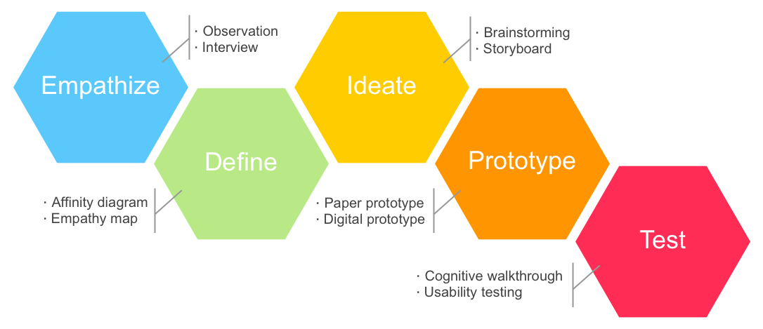
Design Process
This was a design mission in my Interaction Design Practice course. We were asked to find a real problem happening on campus and go through the design process.
1. Empathize
At the beginning of the design process, we asked ourselves who we are designing for, what are their pain points, and how to make their experience better?
Observation
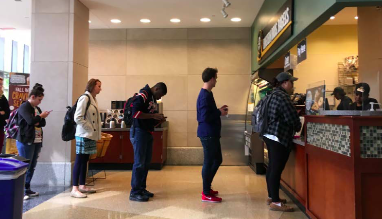
I observed students buying food on campus at peak time (around 12pm). By sitting aside and counting time they spent with my stopwatch, it was really surprising that students spent over 30 minutes to get a coffee and a bagel.
Interview
To better understand the experience of buying food on campus, I conducted three interviews to find their pain points. Since I wanted to interview with people who had experience of waiting in a long line, I asked people to join the interview right after they left a long waiting queue. Although it was hard to find interviewees who already spent time on a queue for a while, I was able to schedule with three participants to have interviews later.
2. Define
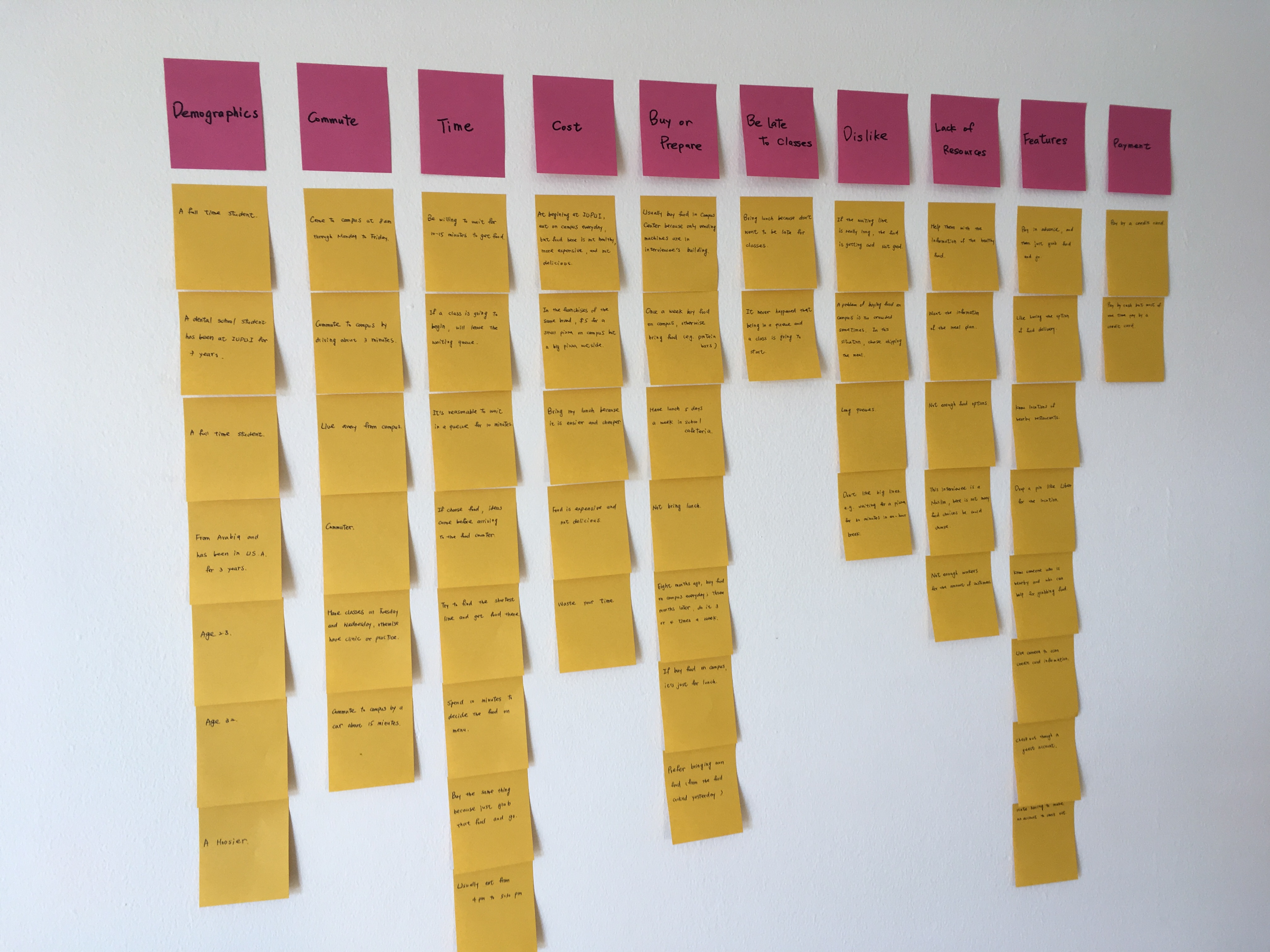
Using the data we collected from observations and 7 interviews, we found the affinity diagram and empathy map are the best ways to define the problem, to categorize and prioritize features, and to put ourselves into users’ shoes.
Affinity Diagram
We wrote down our interviewees' opinions and behaviors onto small cards. Then we categorized these cards into groups and figured out the relationships between the groups. For example, the group "lacking of food information" and the group "lacking of time" could be combined into a more general "resource scarcity" group.
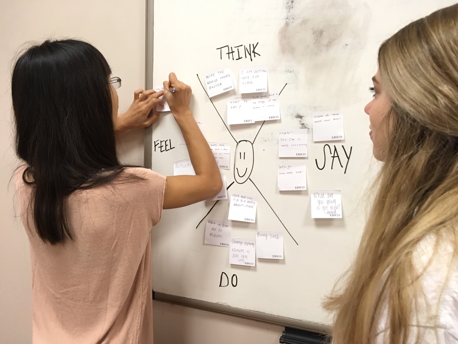
Empathy Map
After we had a firm idea about what we learned from our interviewees, we used an empathy map to think, to say, to do, and to feel what they would think, say, do, and feel in order to build our personas.
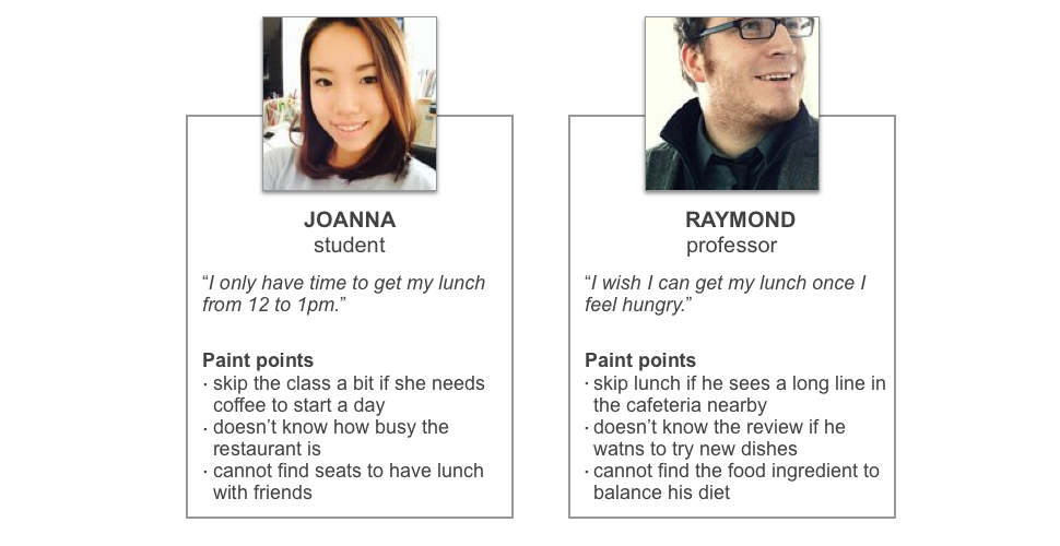
Personas
From the result of the affinity diagram and empathy map, we collected user requirements and used them to build two personas (as seen two personas below), which were for communicating among the team and always keeping in mind who we were designing for.
The Problem
The core problem was "students cannot get food at the time they want and spend too much time waiting in busy lines." This was a problem about the shortage of information and resources: not only are students not sure how long they should wait for food, restaurants are also not sure how much food they should prepare and at what times.
3. Ideate
Design Direction
We had three sessions of brainstorming and came up with 80 features, which can solve the problem in different ways. After categorizing and prioritizing ideas, we grouped them into four features we were after:
- Waiting-time estimation
- Pre-order, prepay and pick up
- Interactive menu
- Delivery service by friends
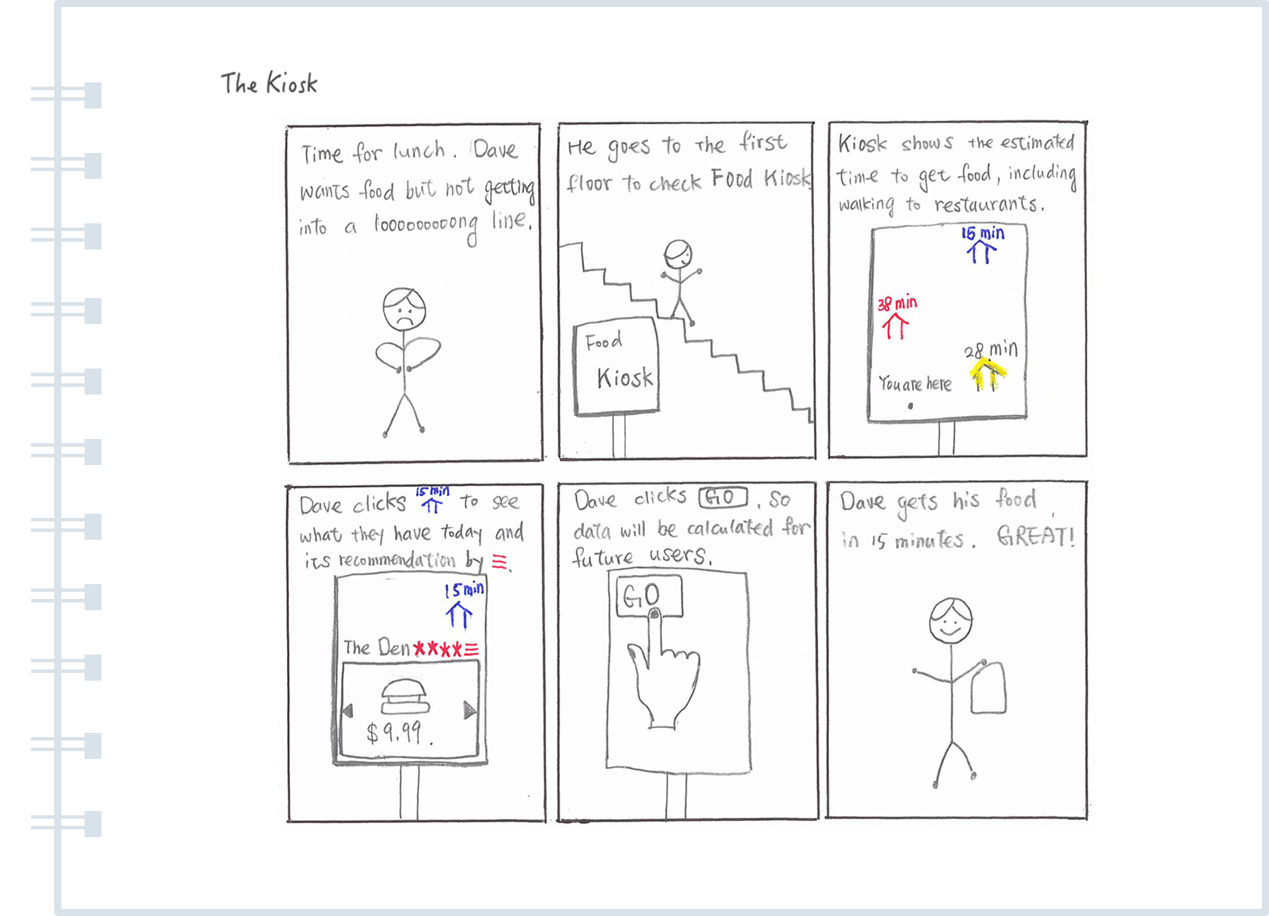
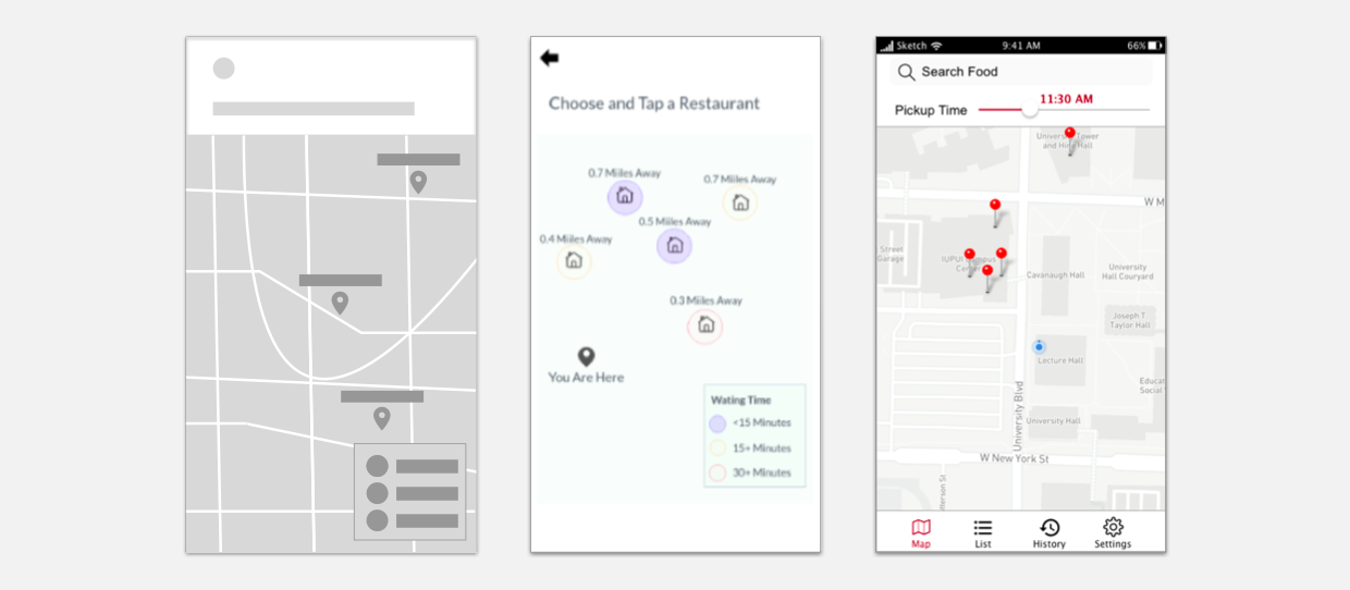
Storyboards
With two personas and scenarios, we drew storyboards for three potential solutions: a website, a mobile app, and a kiosk located at school buildings (seen the storyboard below). According to the perspectives of convenience and safety, we moved forward to a mobile application design, which was able to implement features and kept services personal and safe, especially for the online payment.
4. Prototype
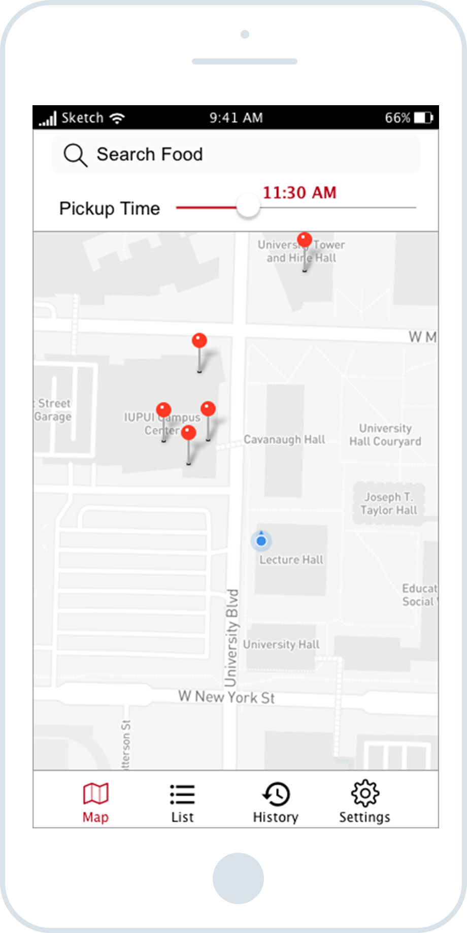
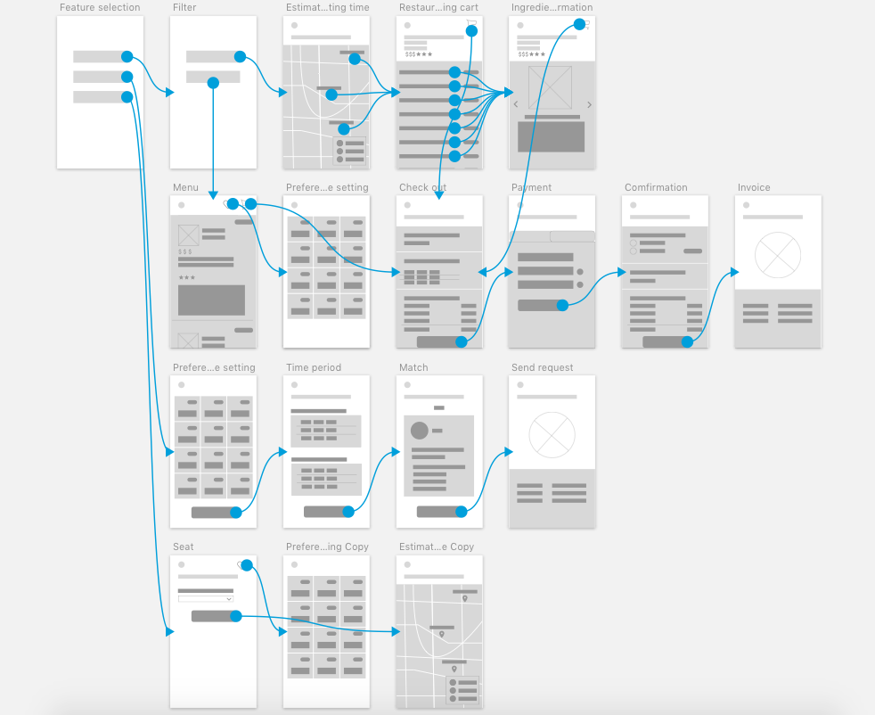
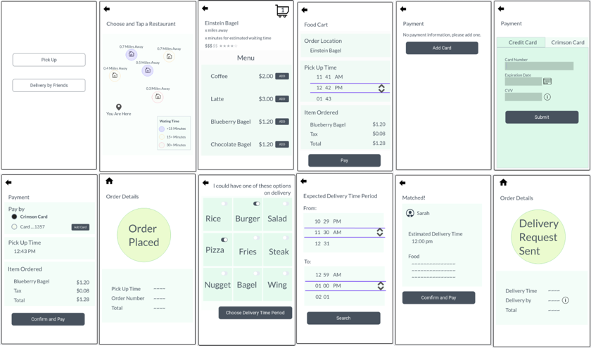
Wireframe
I created the wireframes (seen the wireframes below) and user flow, in order to make sure that we included key features and the information elements displayed properly.
Low-Fidelity Prototype
Instead of focusing on the pixel picking, our team used low-fidelity prototype in testing with participants. Thus, we would get feedback more about the user flow and functionalities rather than, for example, colors.
5. Test
Cognitive Walkthrough and Think Aloud Exercise
Testing is an opportunity to learn about our assumptions, our solutions, and our users. We conducted two runs of testing: one was the cognitive walkthrough with wireframes (as seen the wireframe at the left screen below) among the team, and the other one was the think aloud exercise with the low-fidelity prototype (as seen the prototype in the middle of the following screens) with three users, who bought food on campus at least three times a week. To test key features, the tasks in the think aloud exercises were:
- Order food and pick it up
- Order food and request friends to deliver
- Check out new restaurants and their menus
Reflection
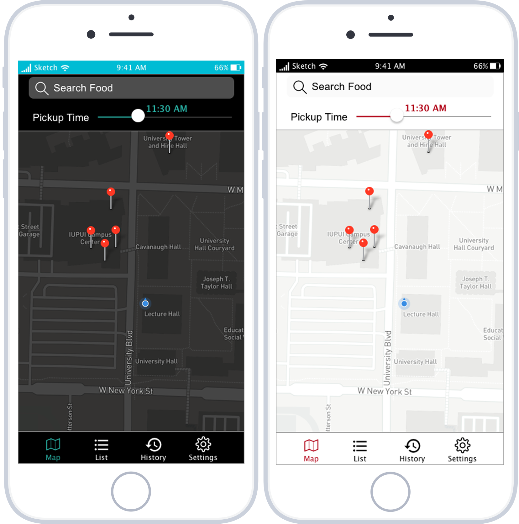
I believe designers have more challenges to put themselves aside in order to make user-centered design happened. Moreover, through the team work with people having different backgrounds, we shared ideas and learned from each them. For example, after knowing there were light mode and dark mode in UI design for using in different environmental situations, I used my own time to read articles, to use new digital tools and to practice. (as seen the map screen in light and dark modes below) It was fun and challenging designing according to users’ needs, and thanks for my team to grow with me!