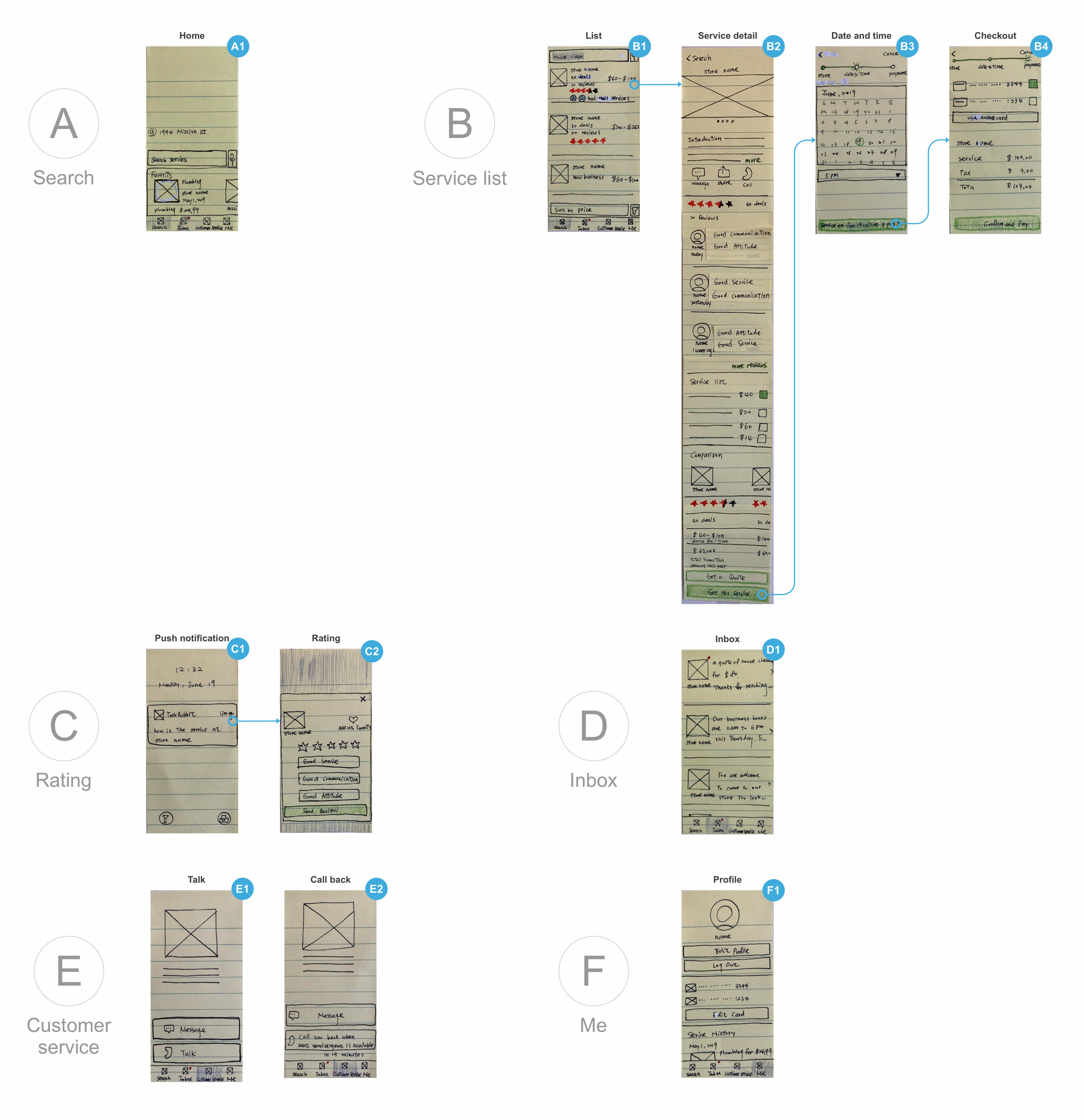
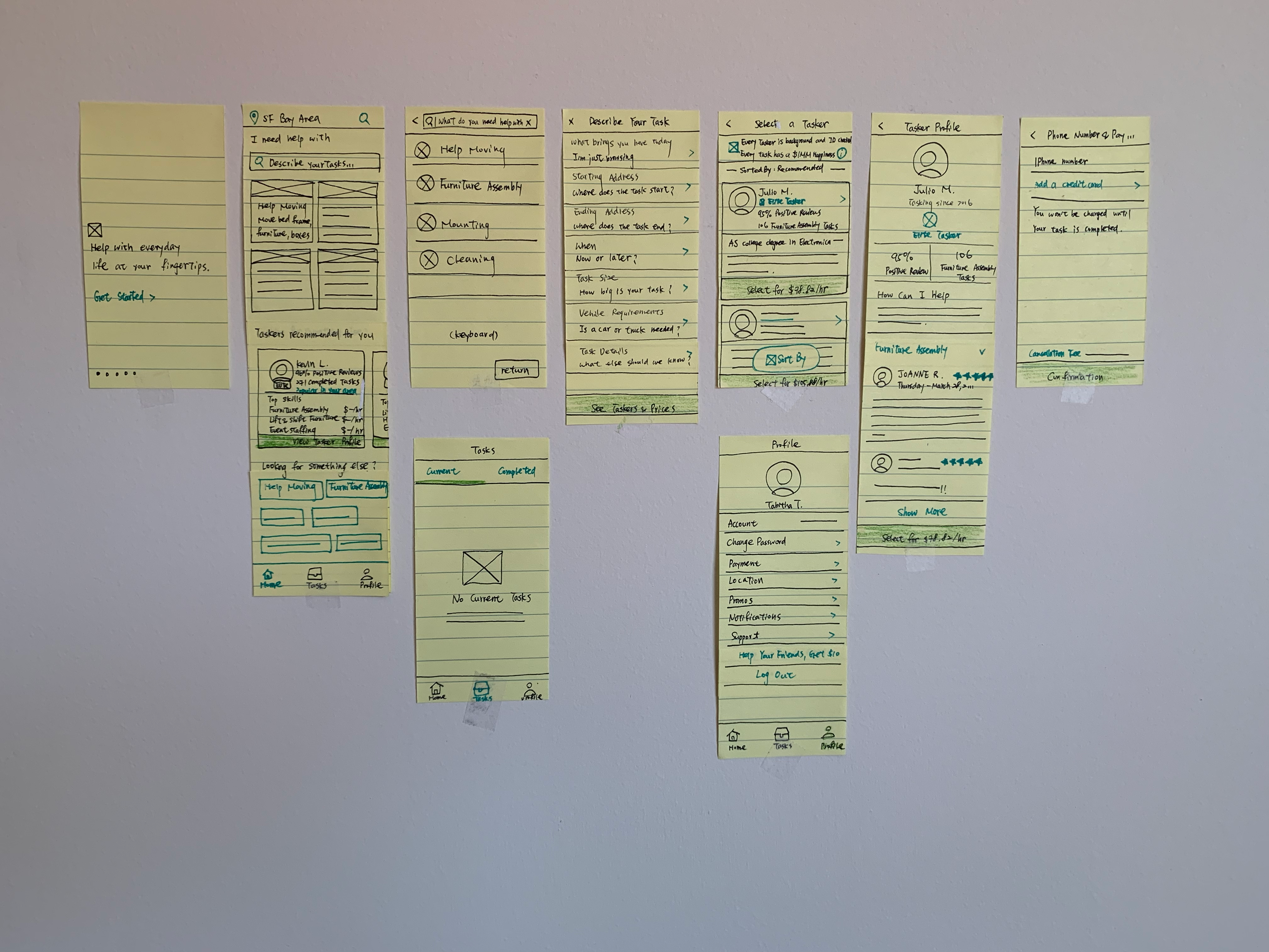
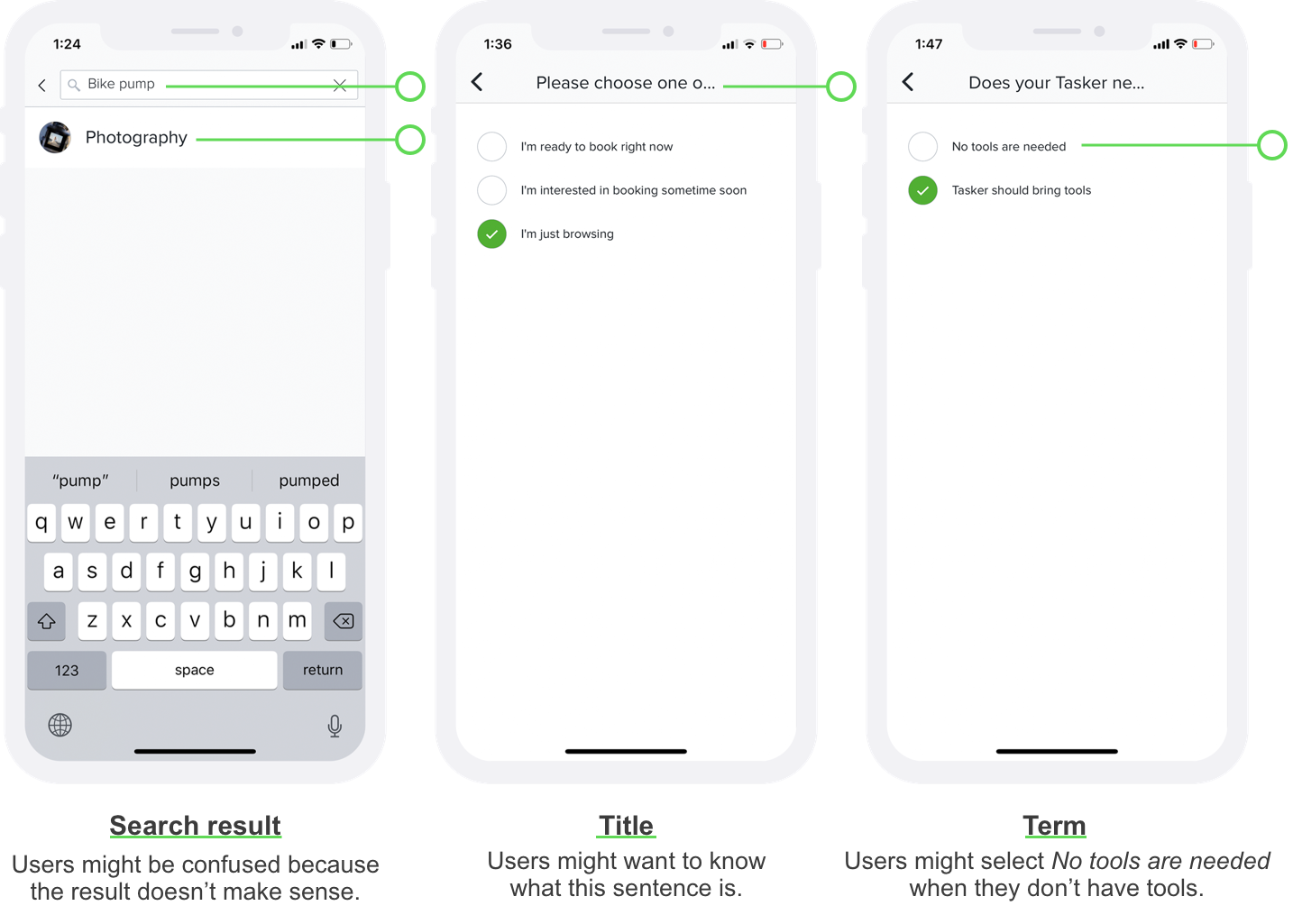
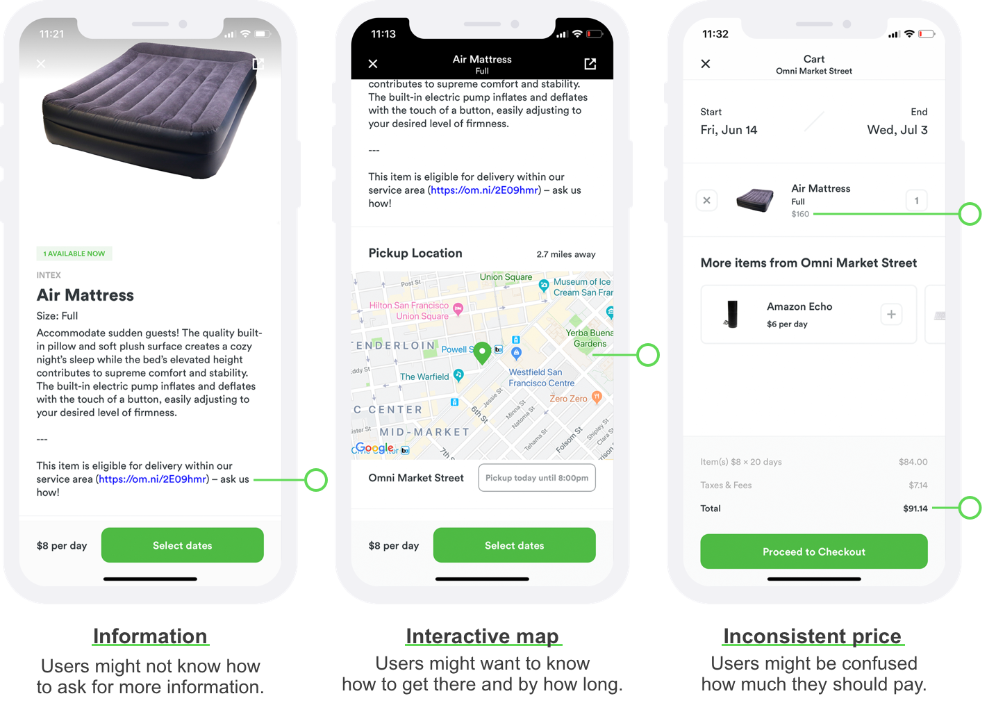
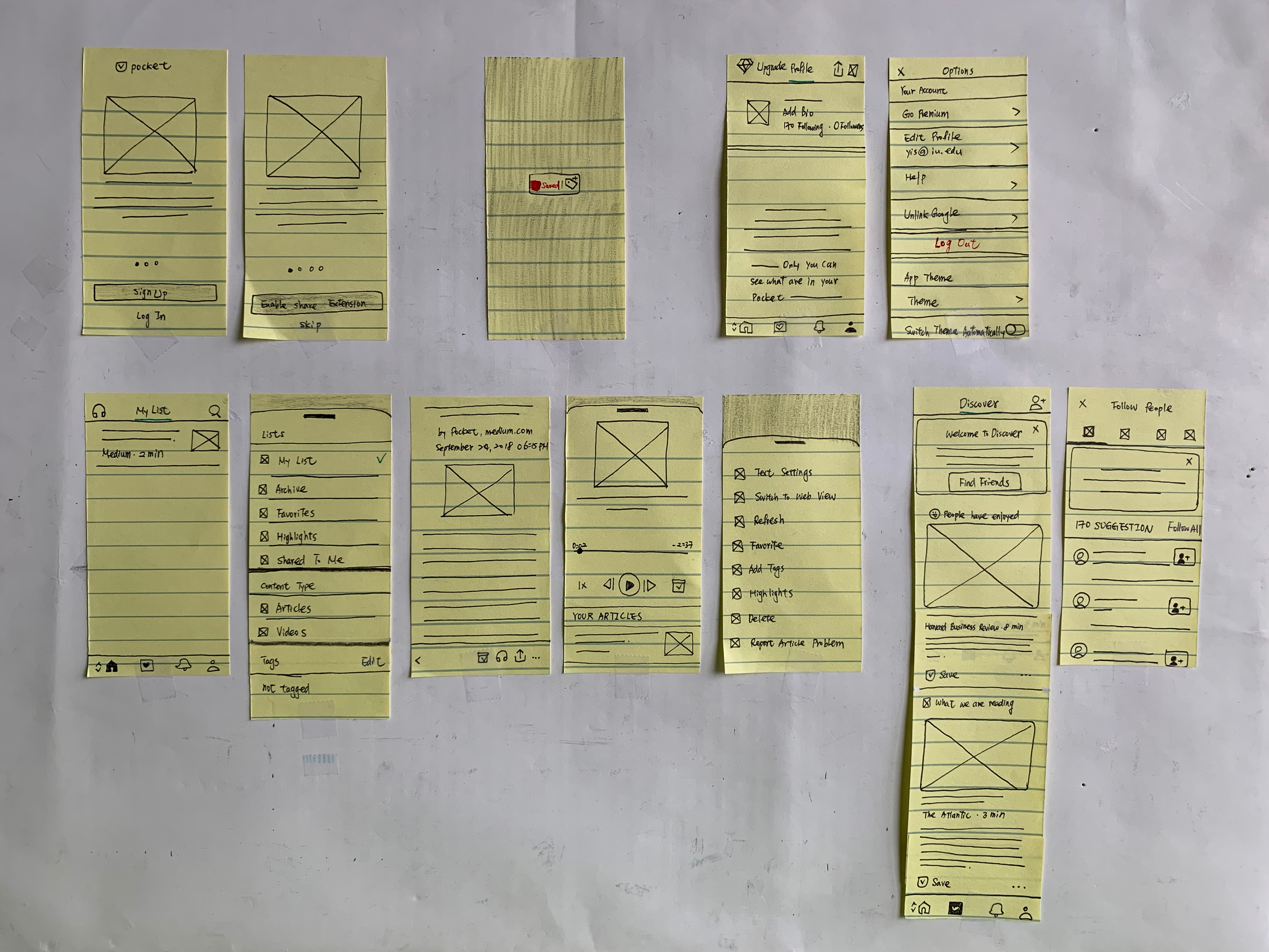
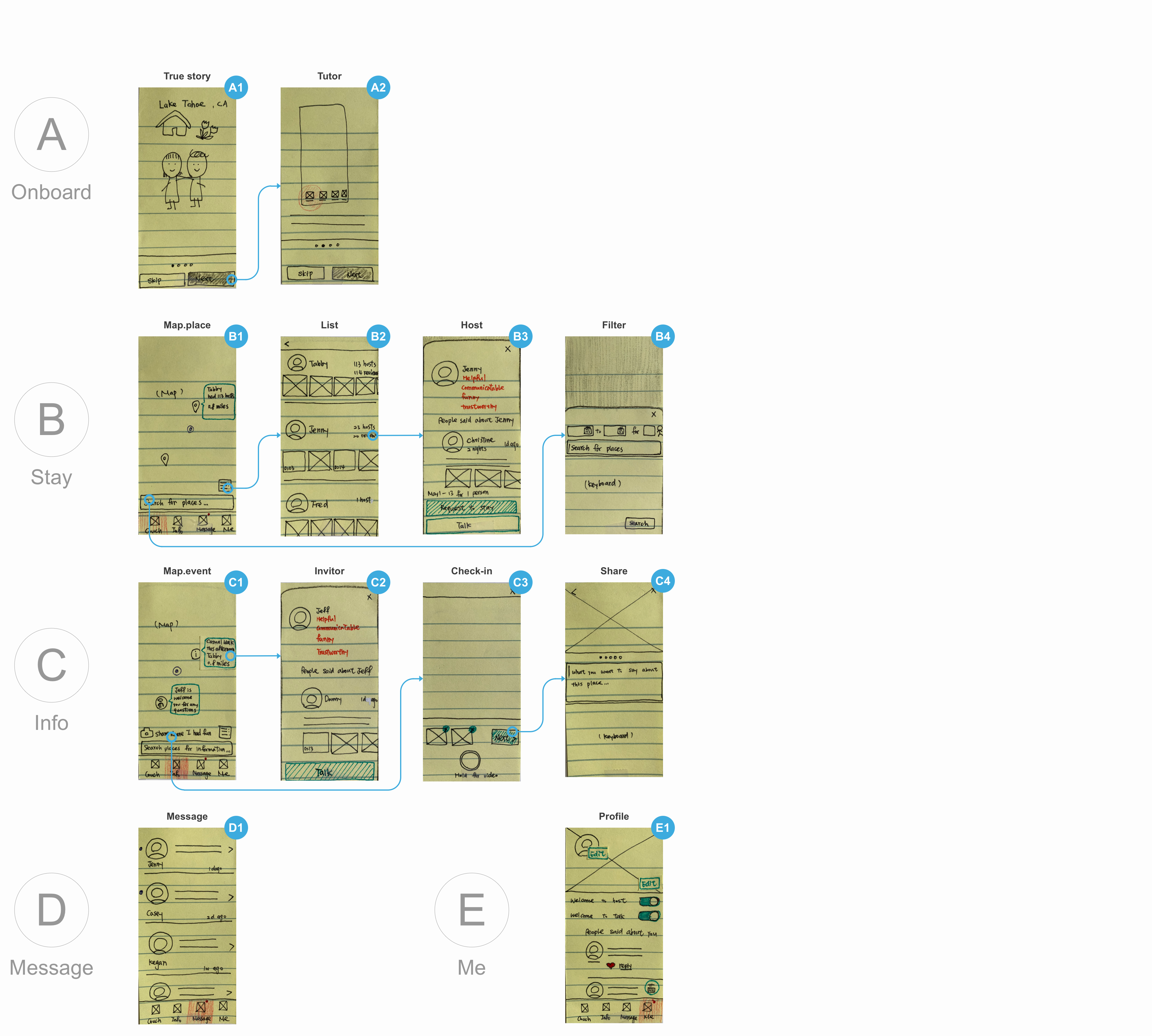
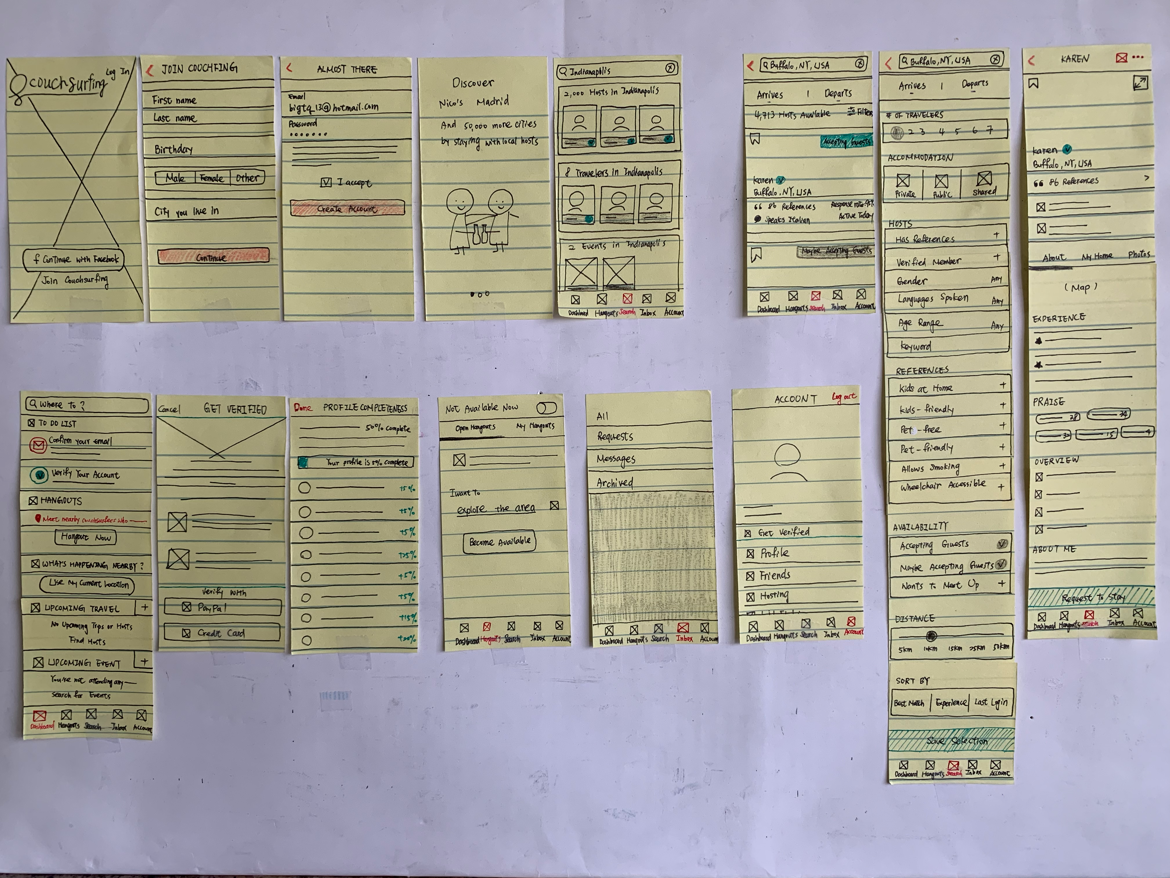
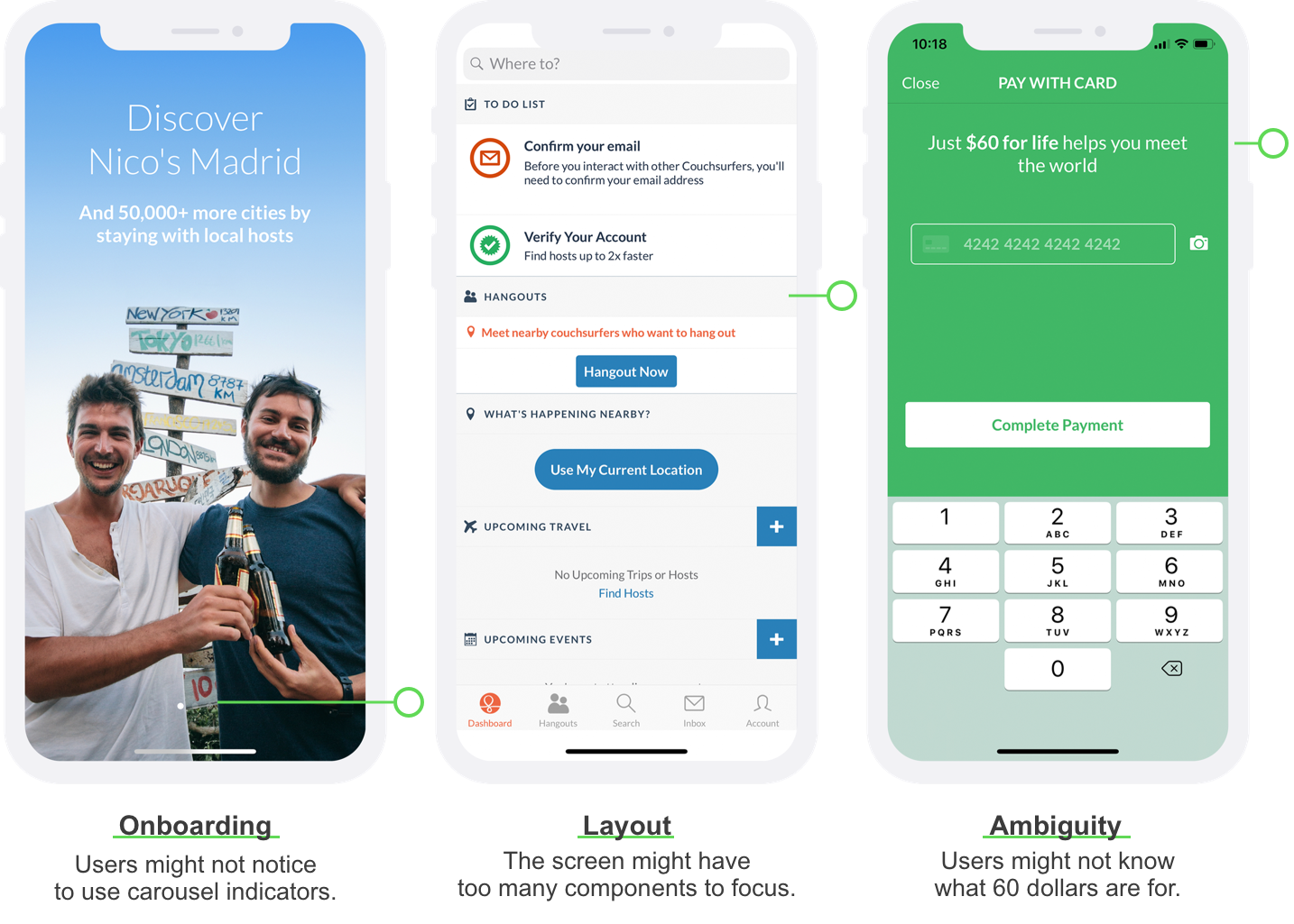
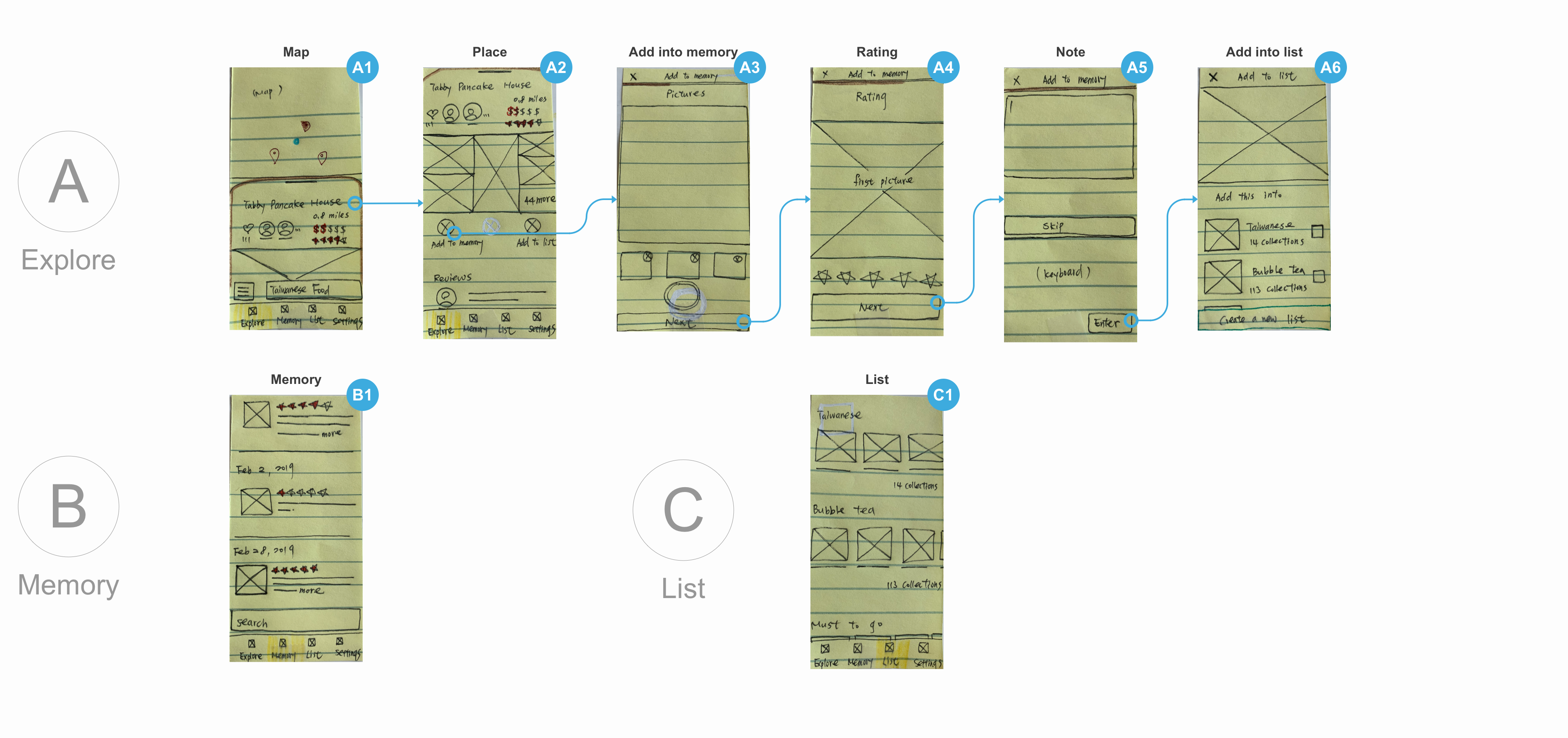
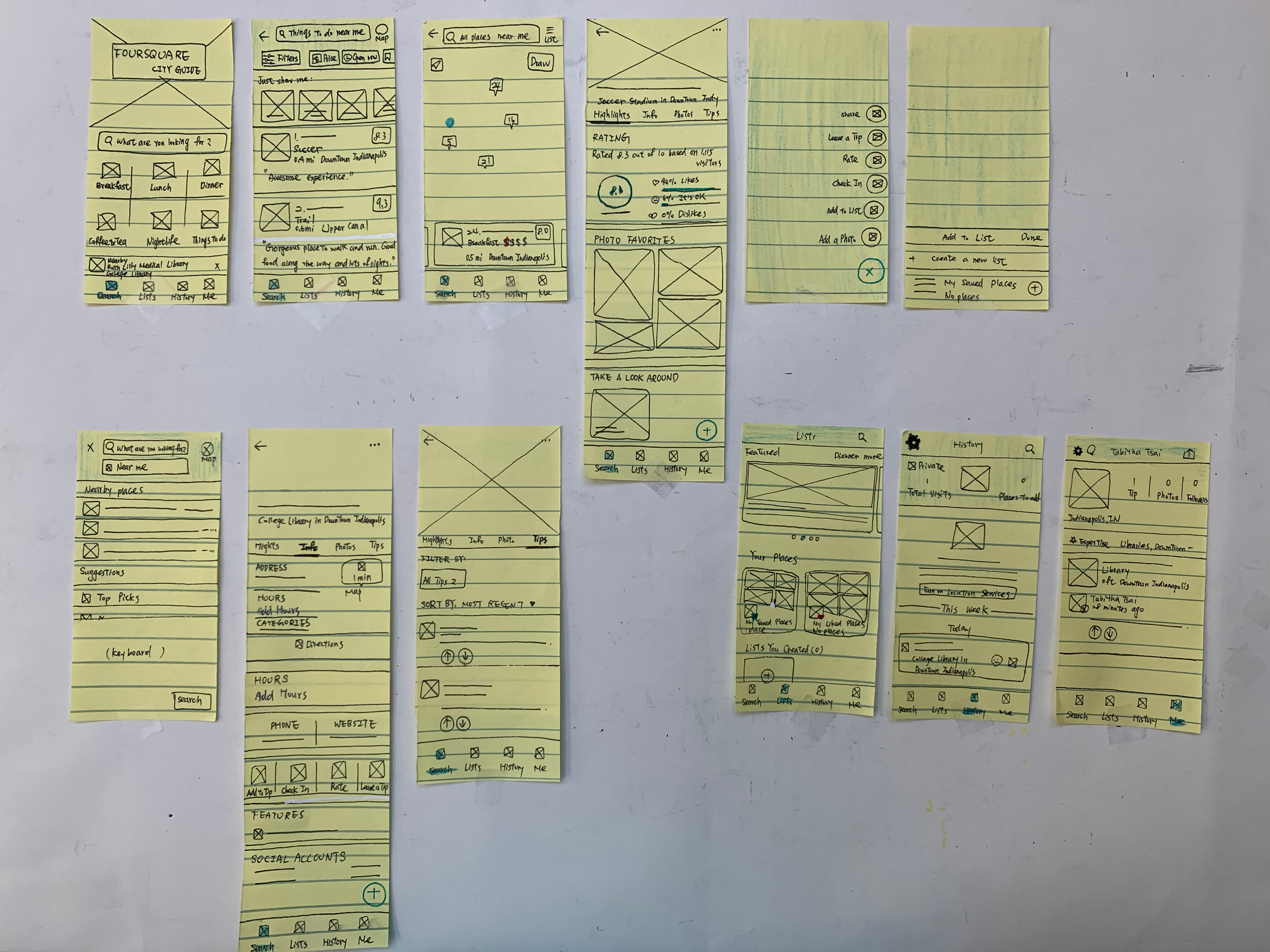
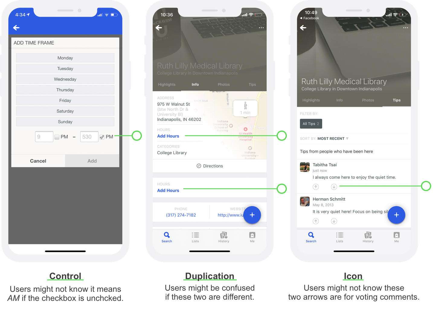
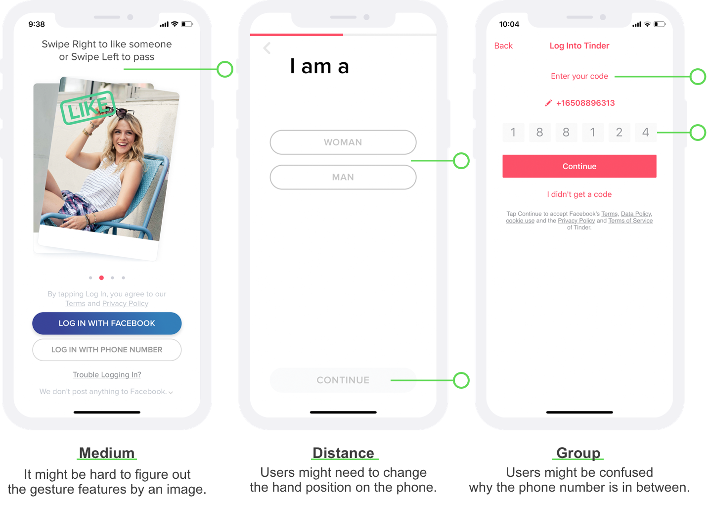
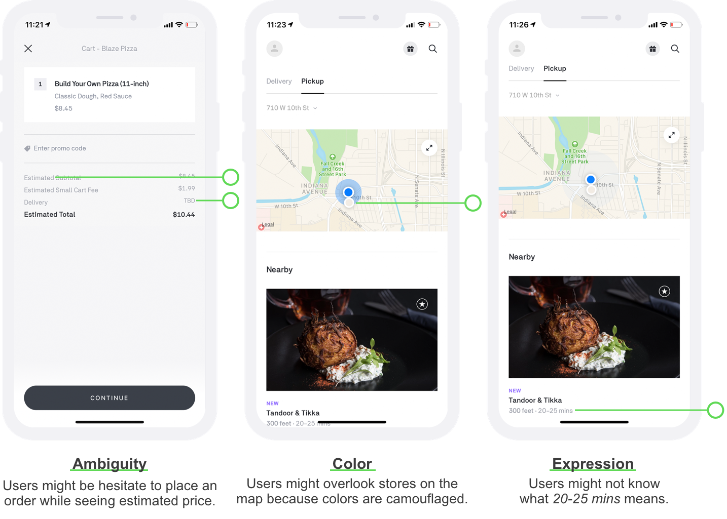
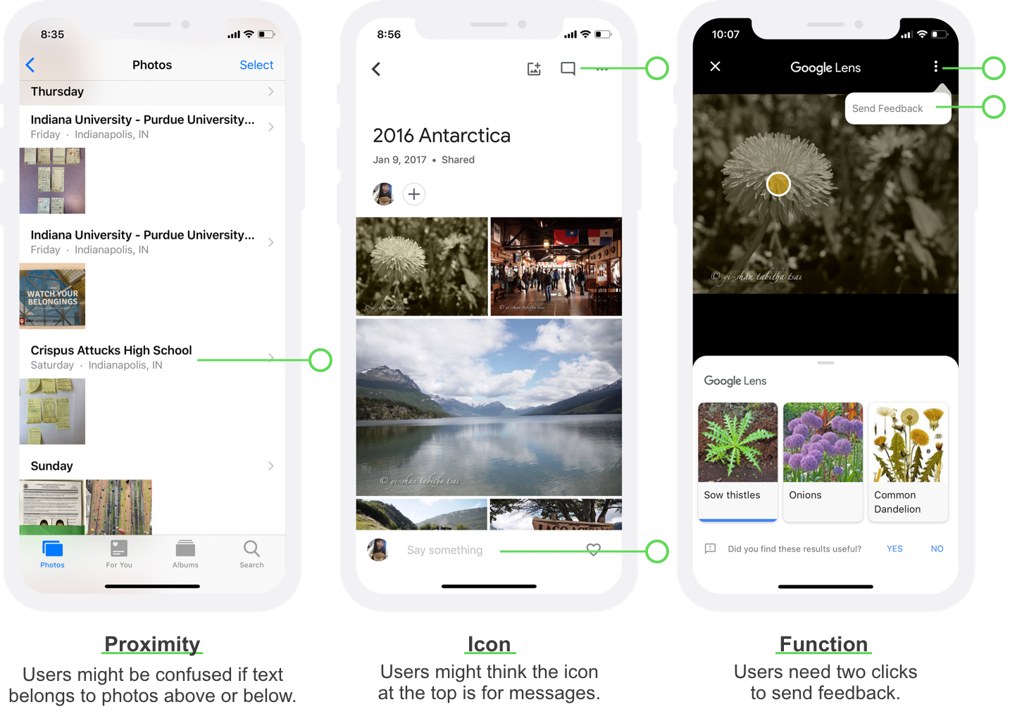
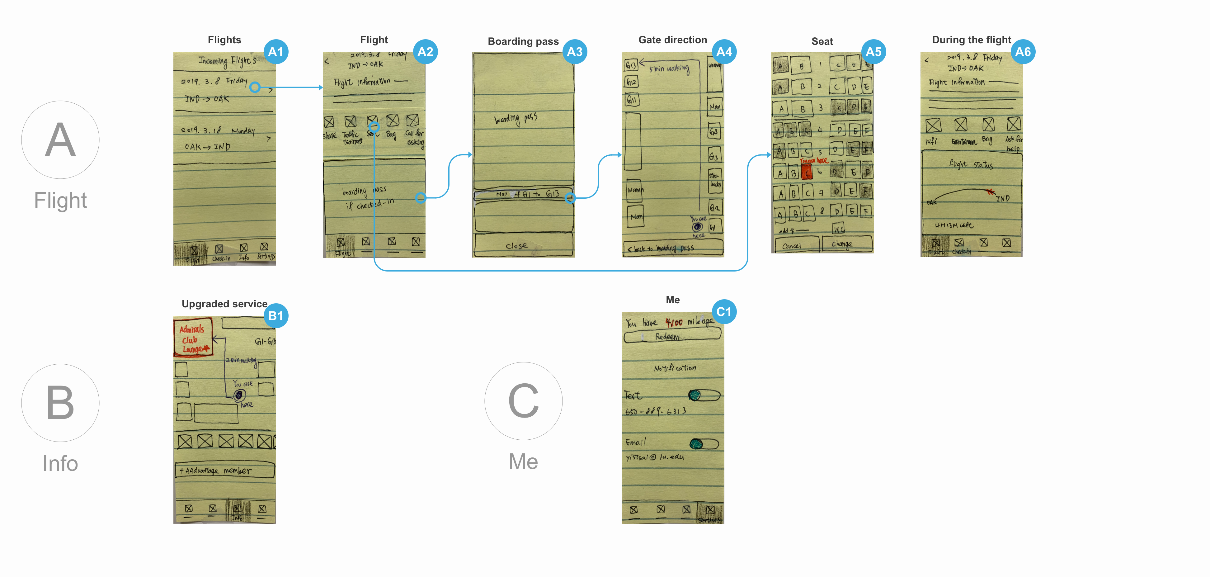
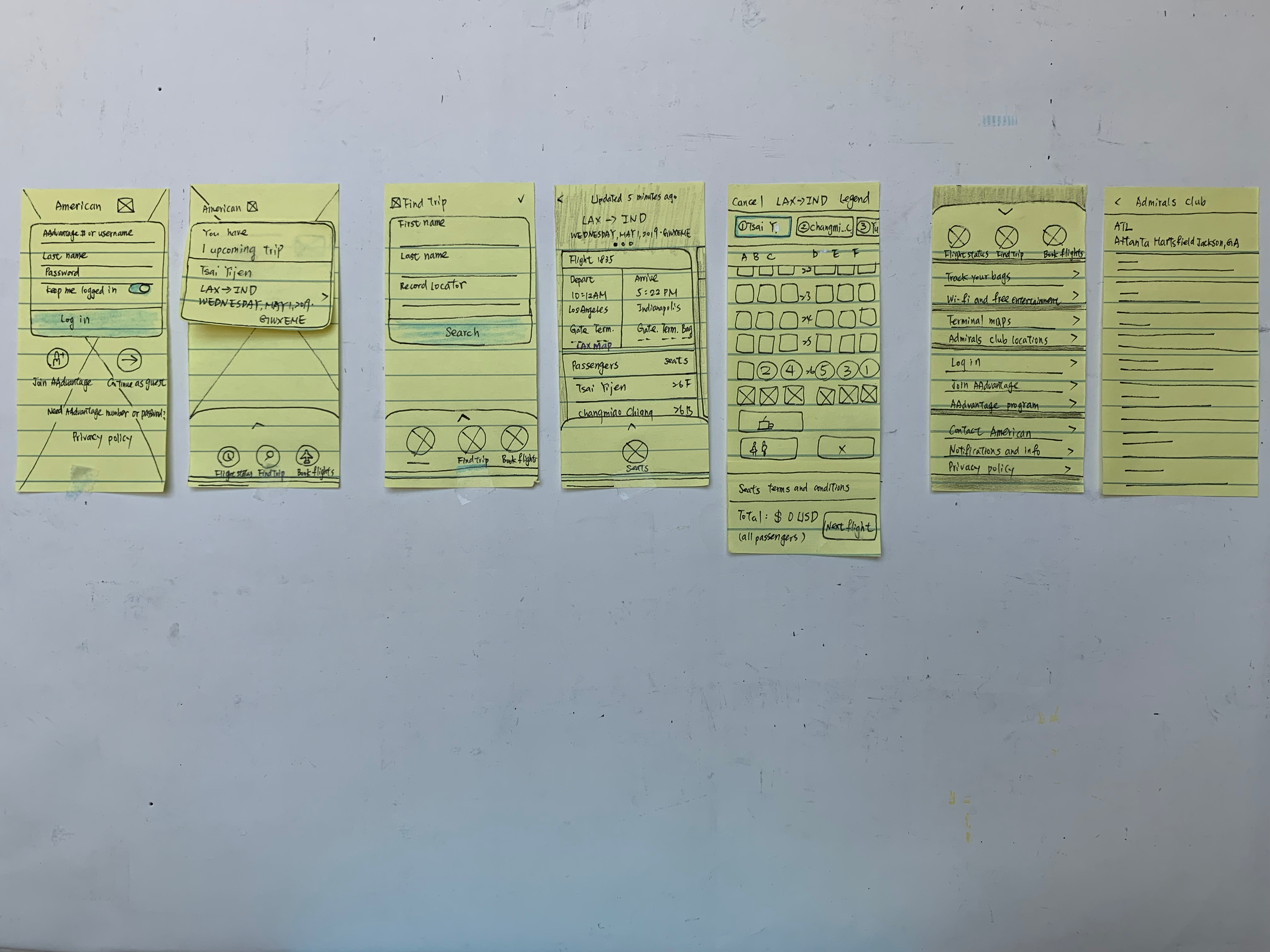
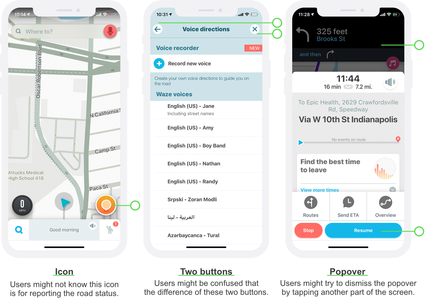
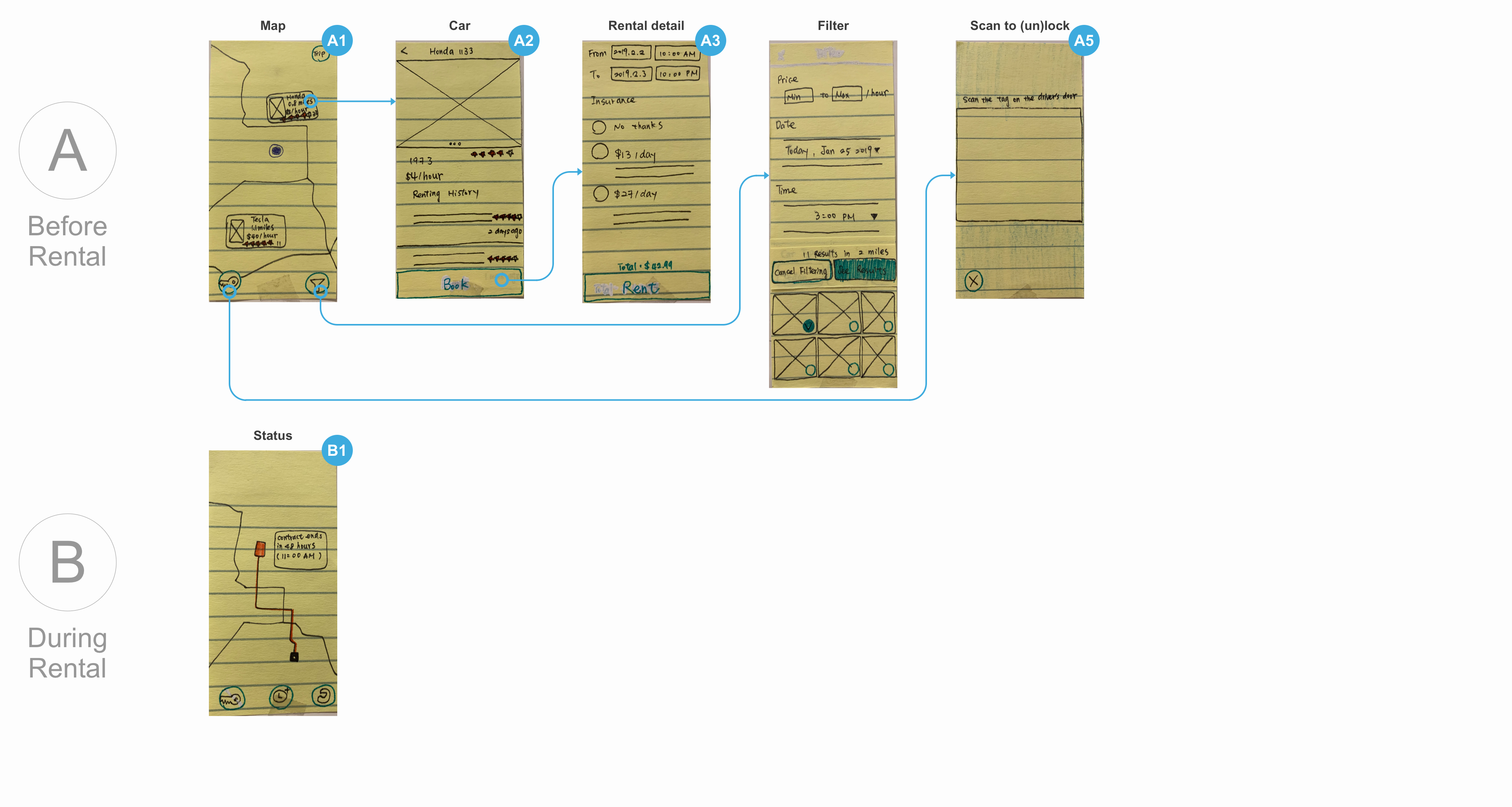
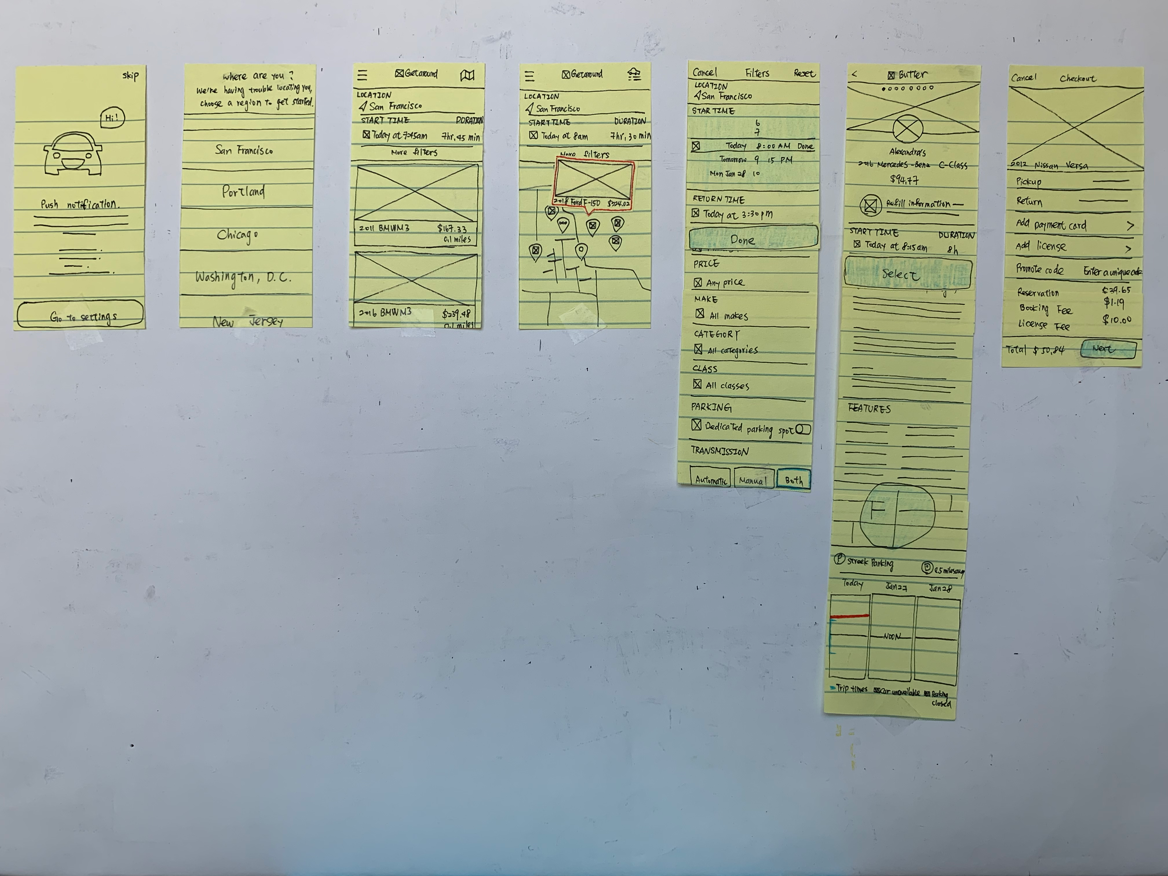
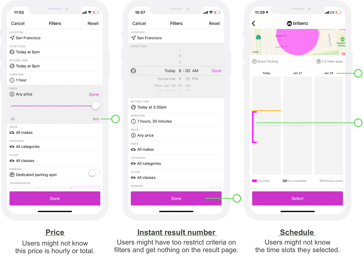
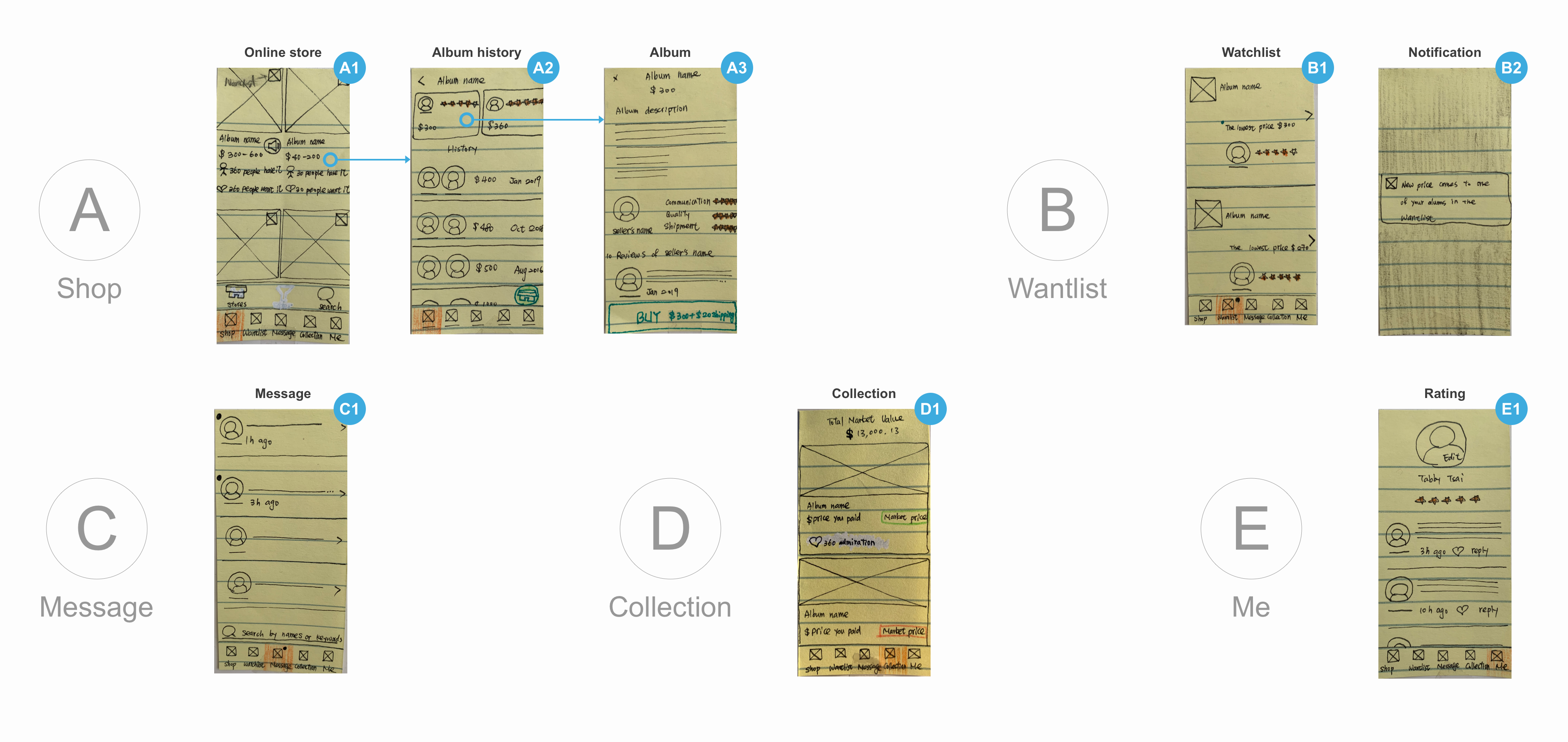
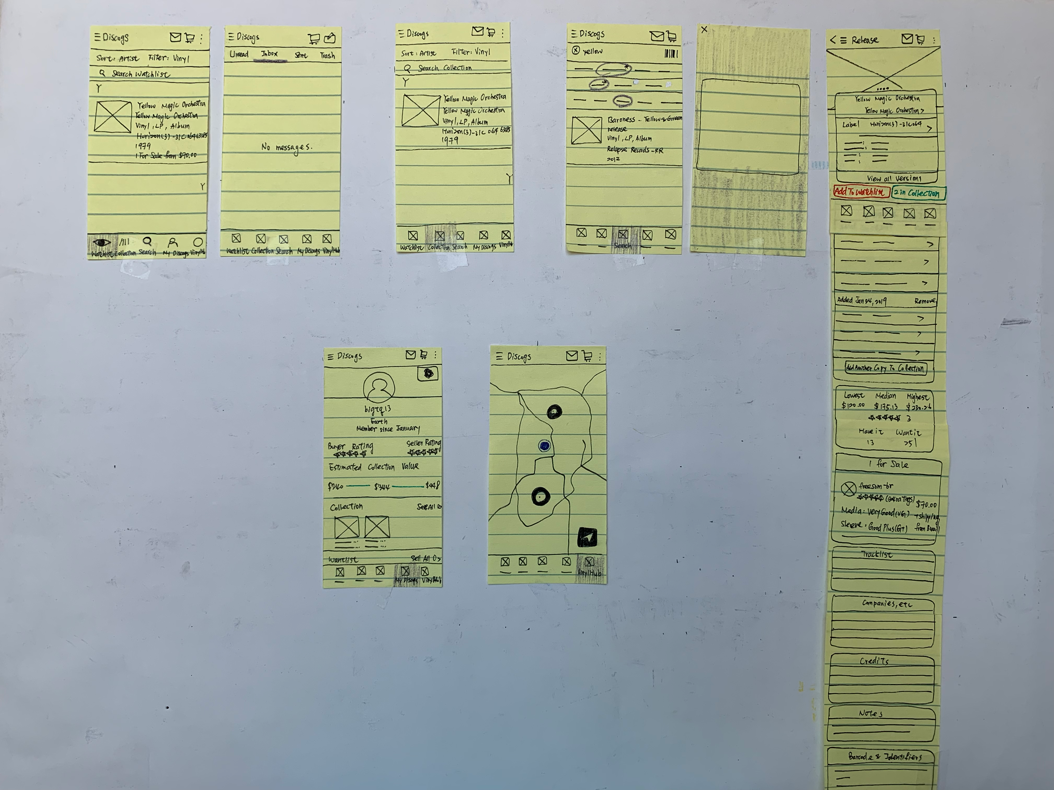
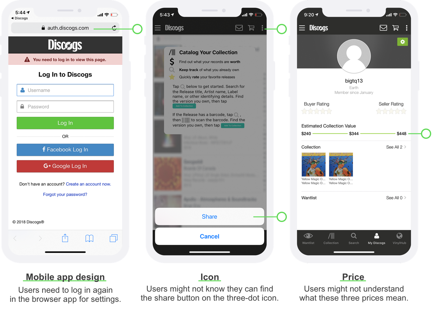
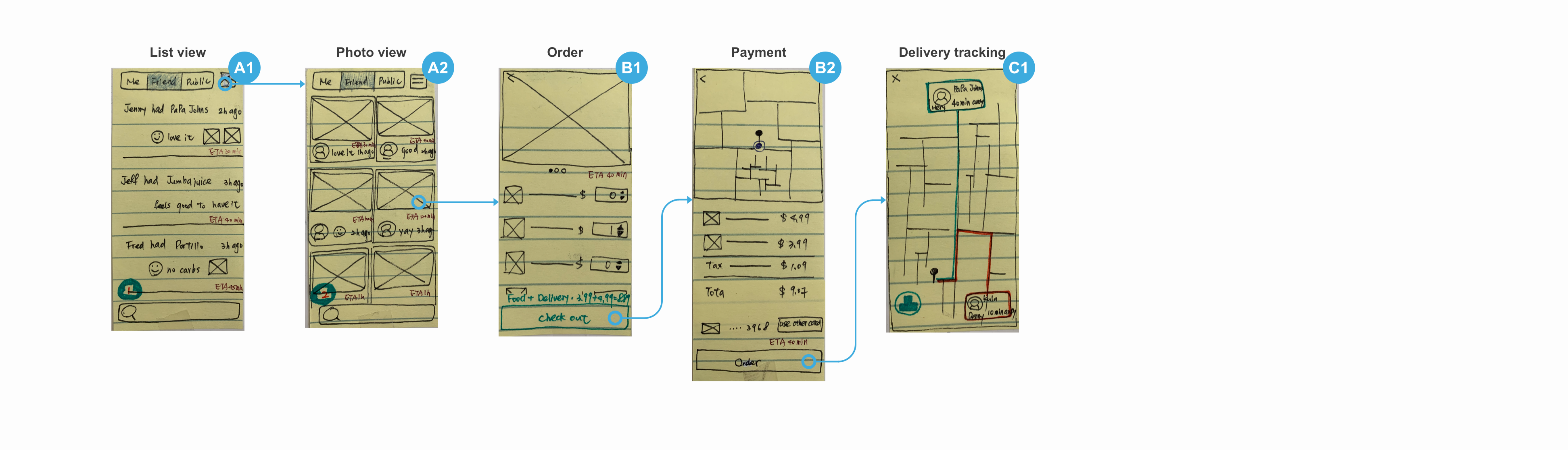
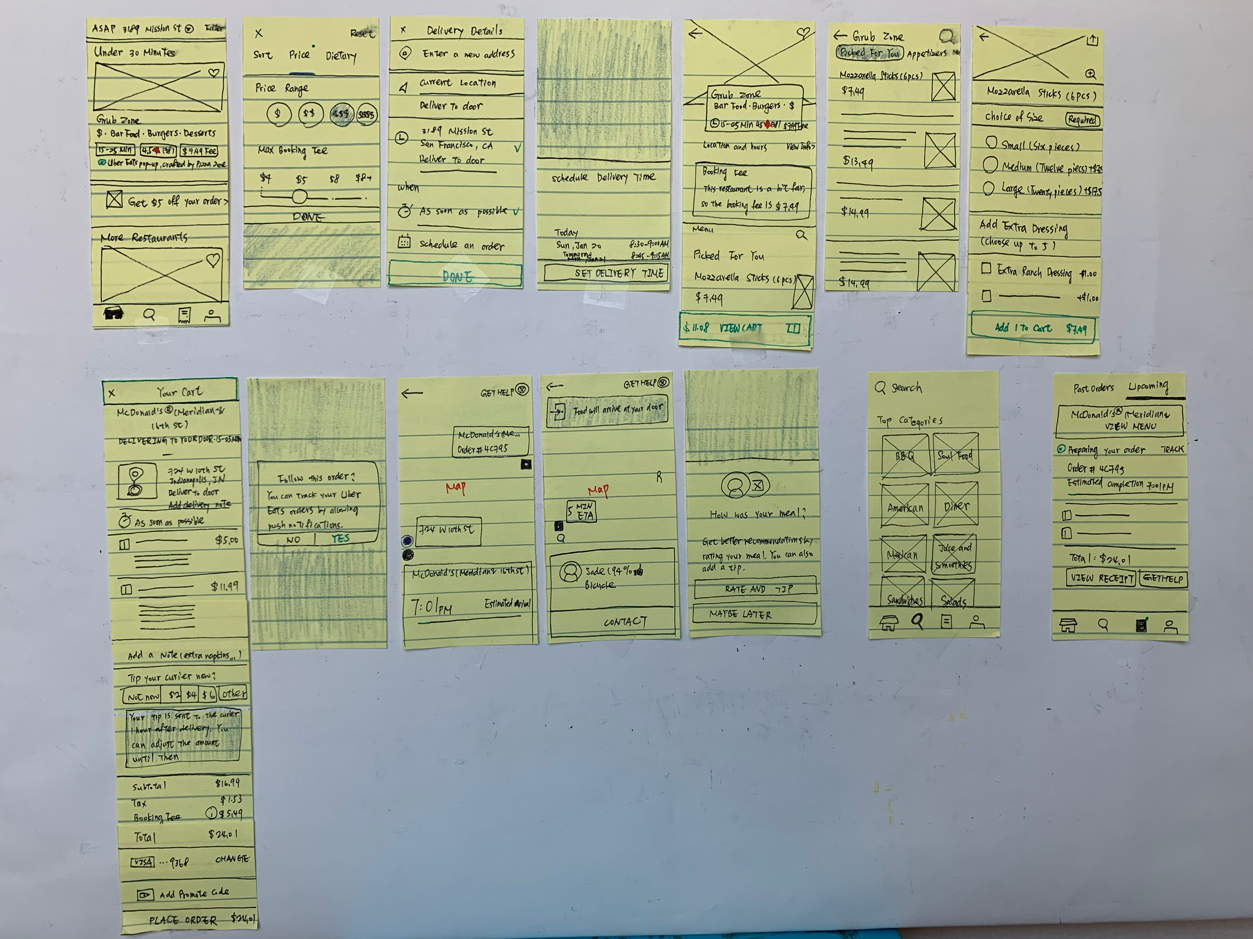
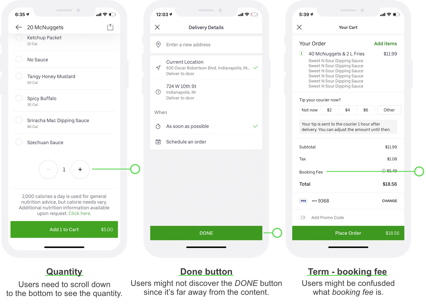
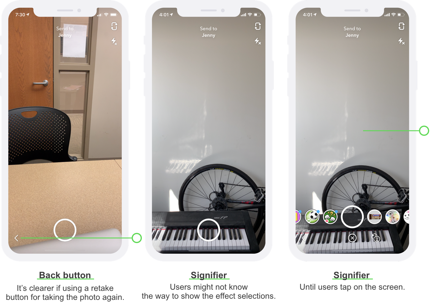
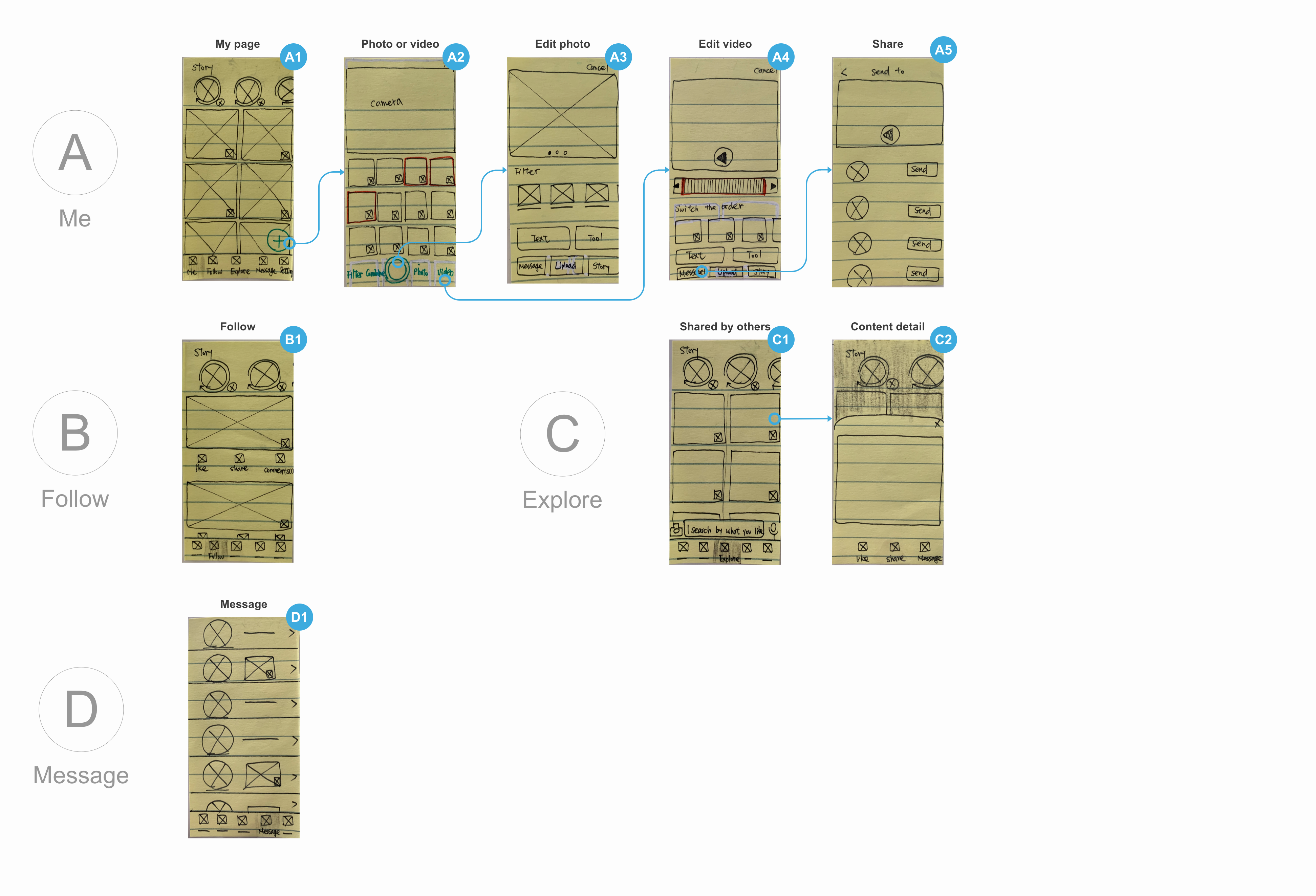
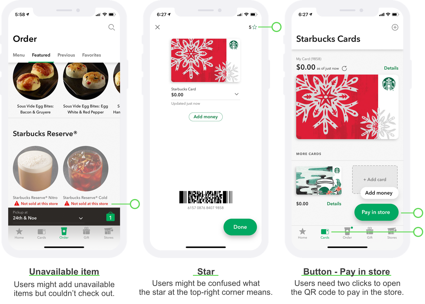
50 App Design Challenges
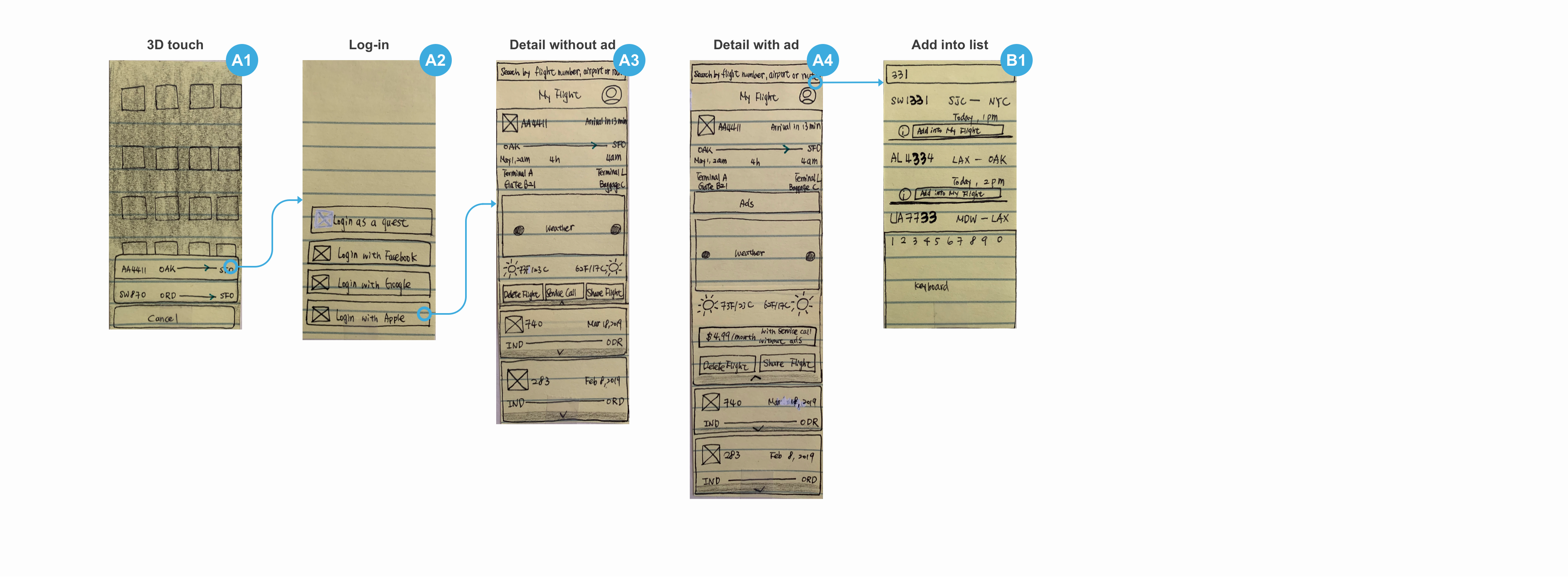
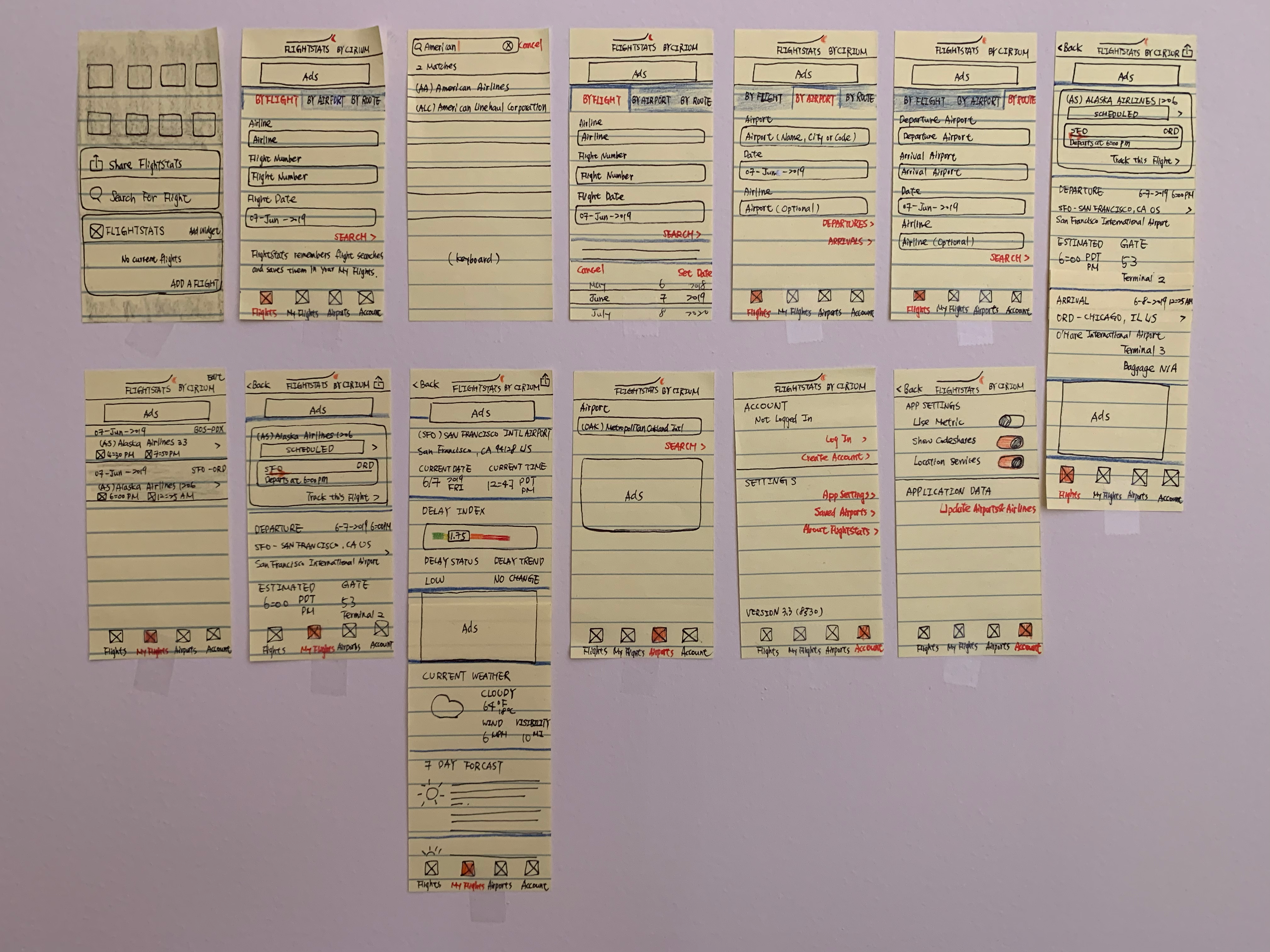
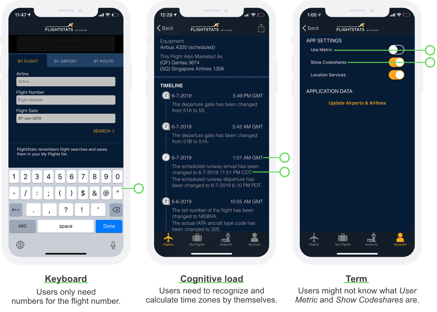
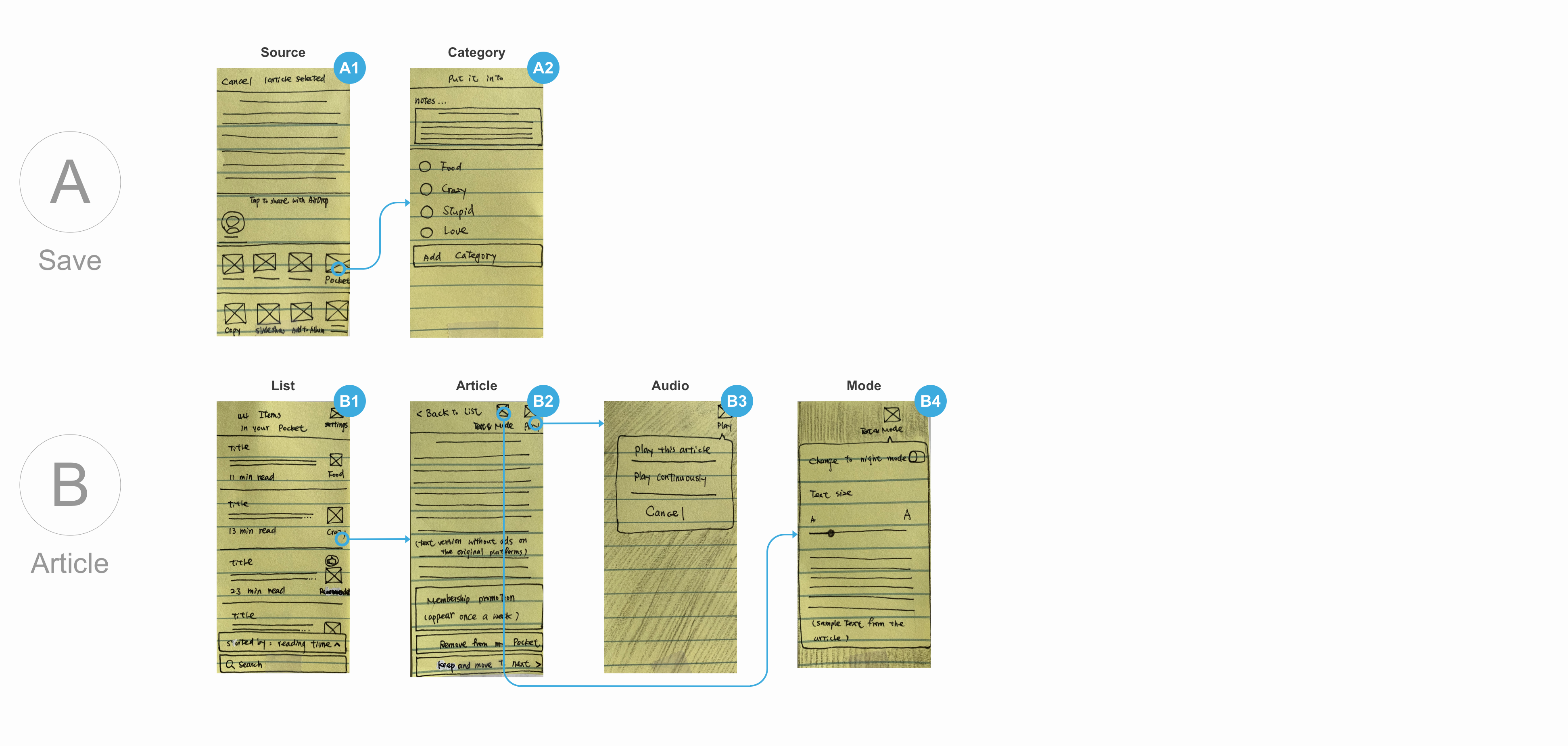
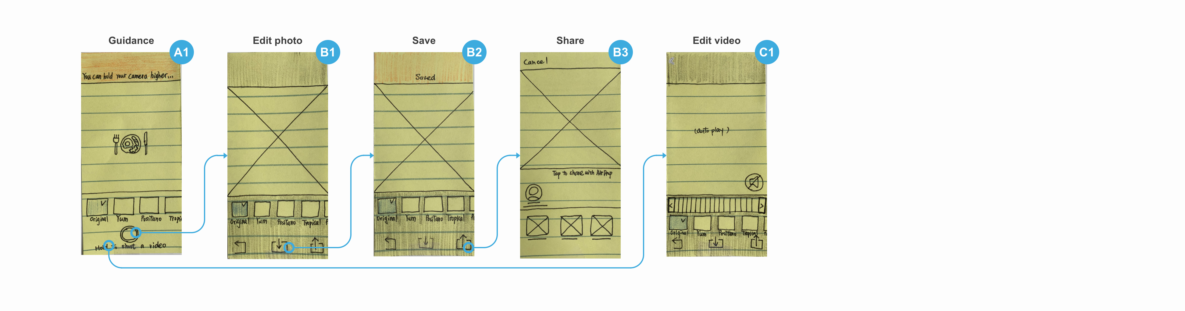
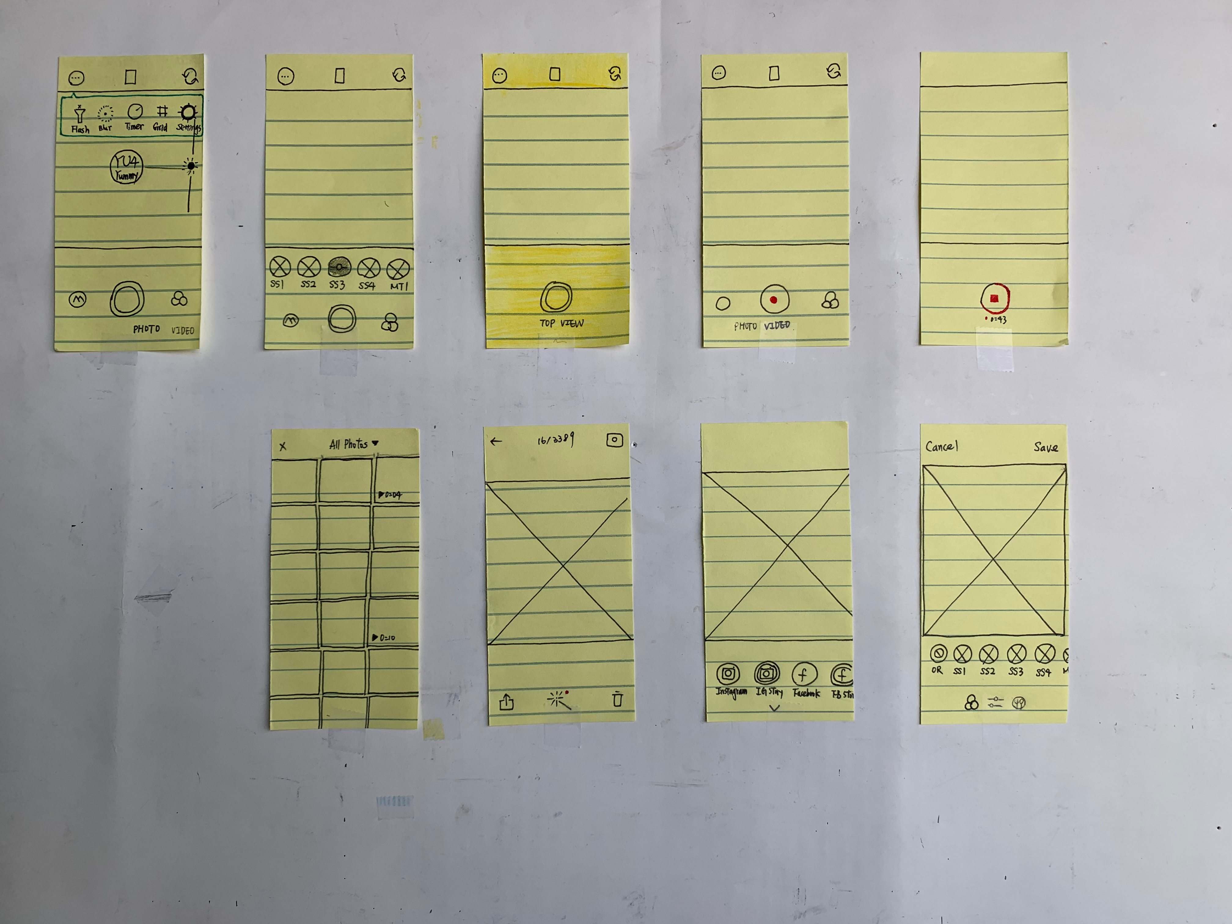
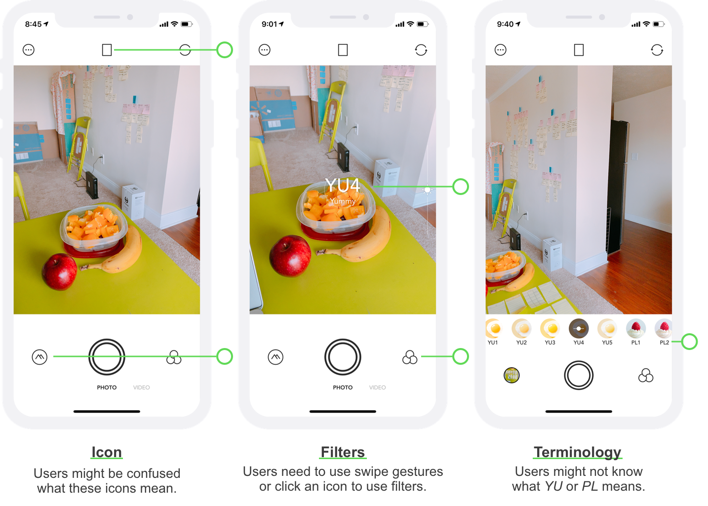
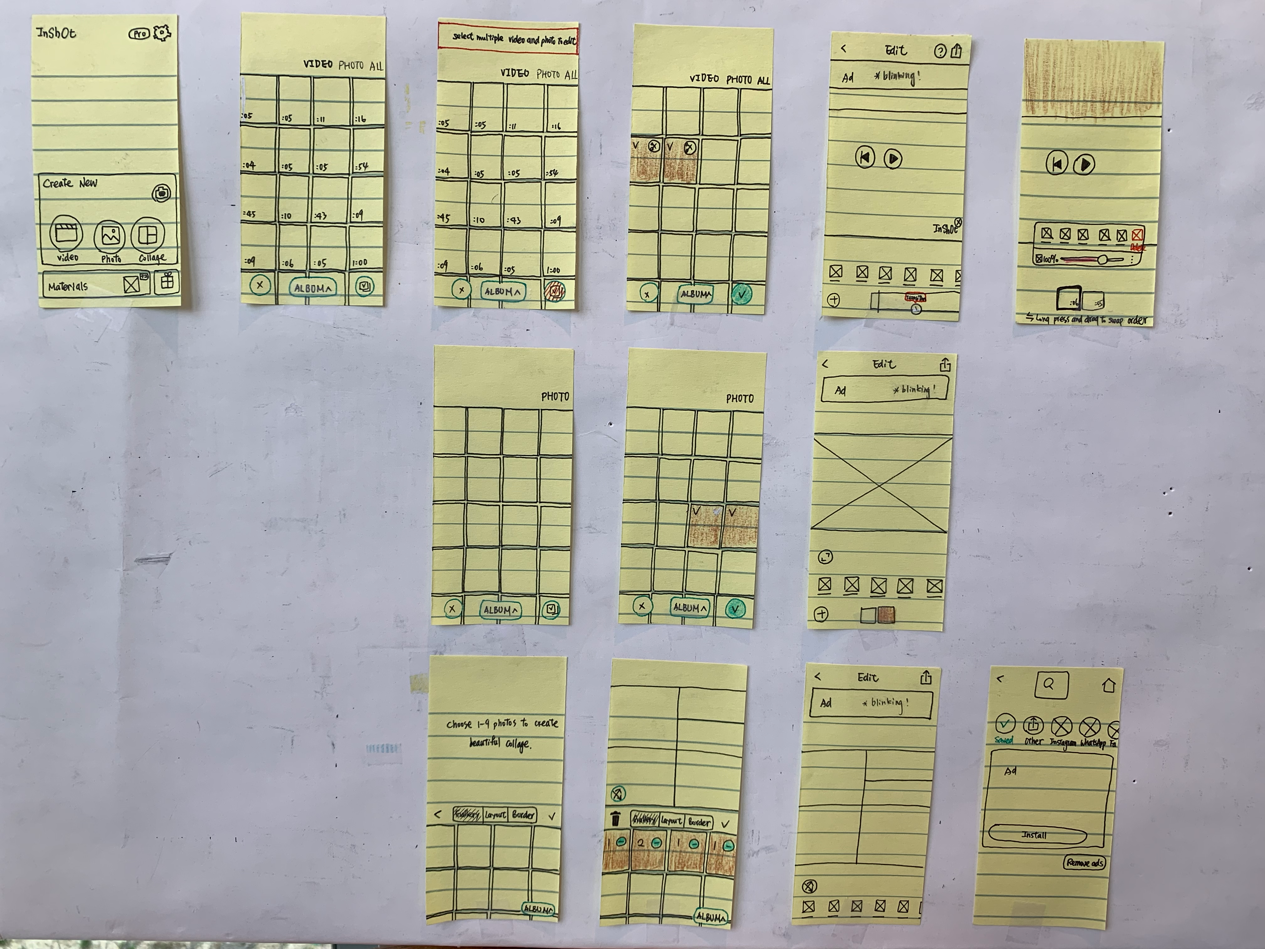
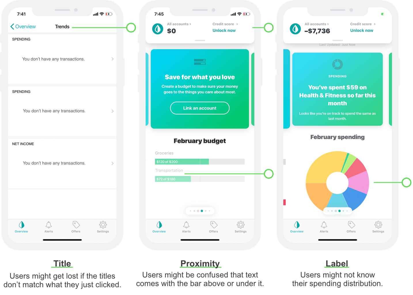
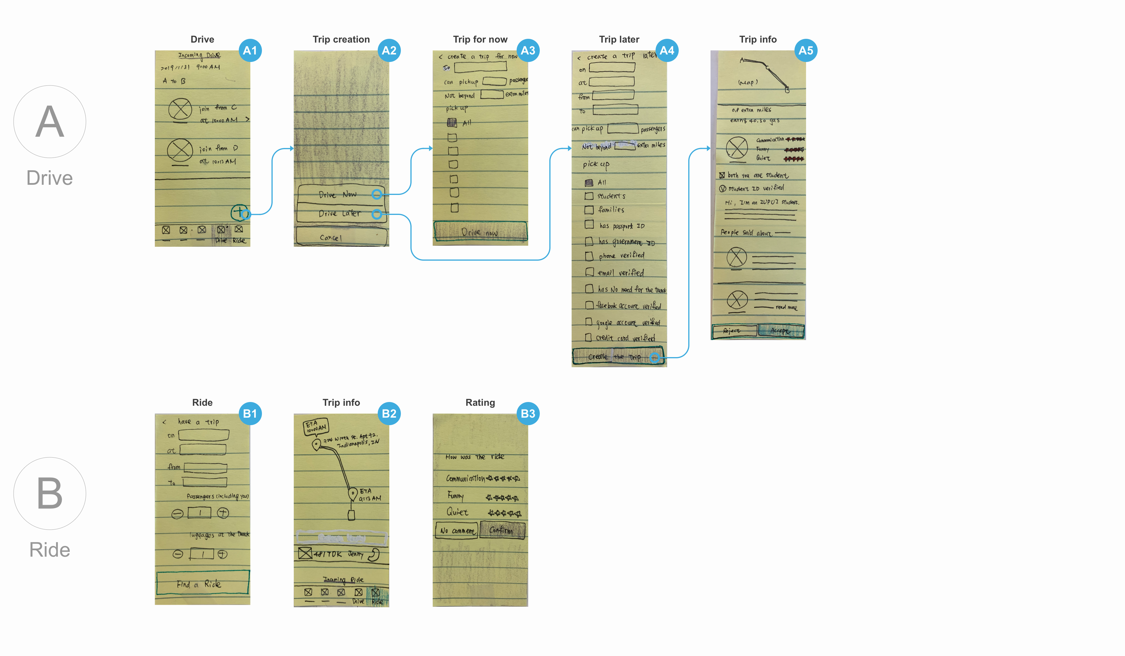
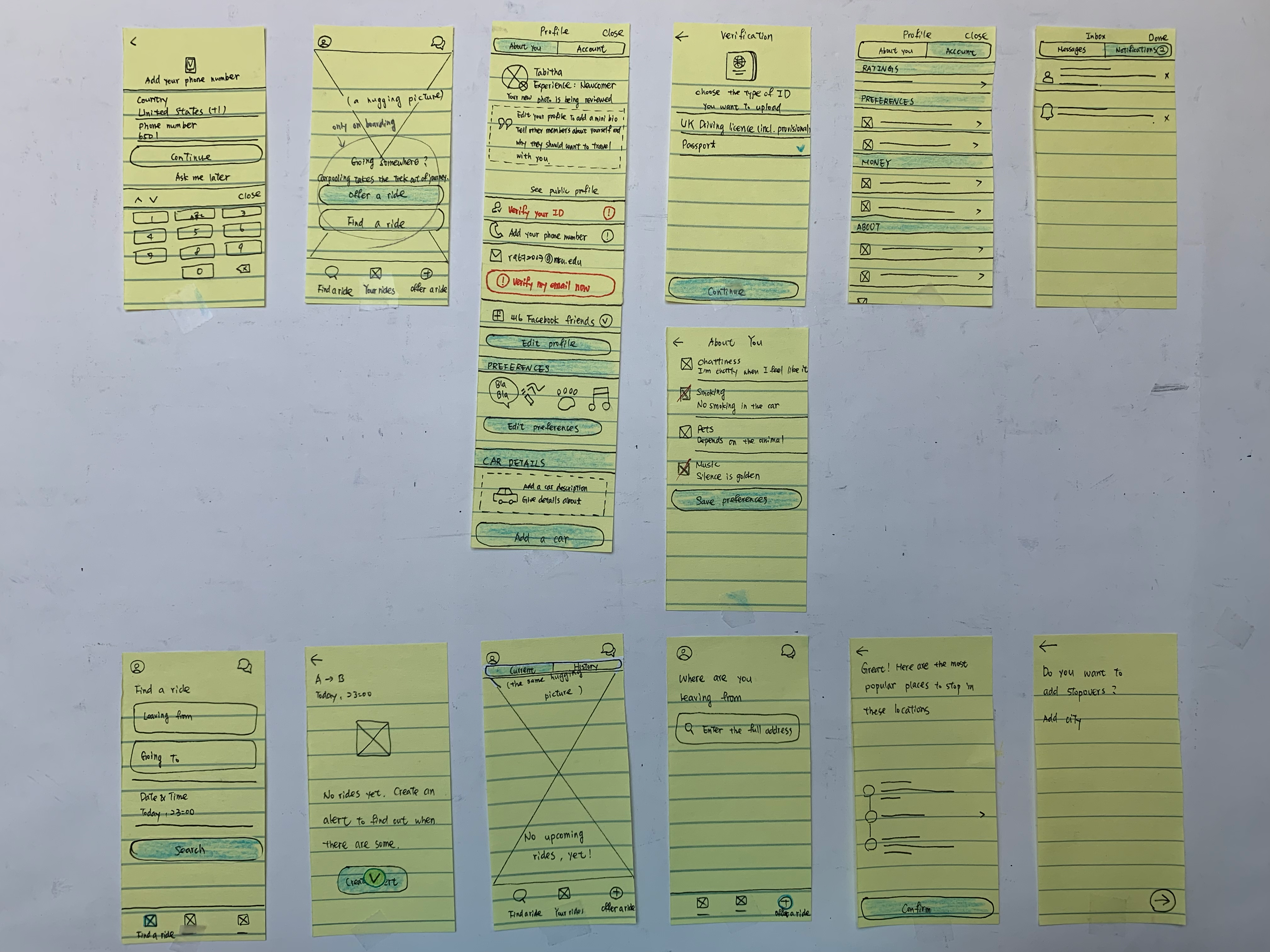
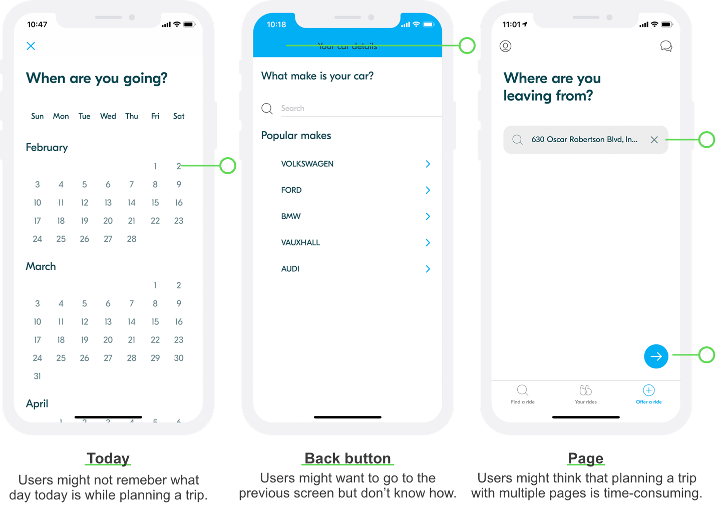
I gave myself design challenges from 50 mobile applications, which I never used. Before opening a new app, I designed interactions based on the app description on App Store. And then, I opened the app and deconstructed interfaces and interactions, while guessing the design rationale and giving critiques and suggestions. Thus, I exposure and enjoy myself in design thinking everyday.
Time: 1/2019 - present (8 months)
My role: product designer
Method: critical thinking
Tool: Sharpie is my best friend.