Internal Applications
Workers Compensation Division in Berkshire Hathaway Homestate Companies (BHHC) helps workers, who get injured at work, receive appropriate medical care and financial compensation. To fulfill the service, many internal roles work with external units, such as doctors and government, through in-house internal systems.
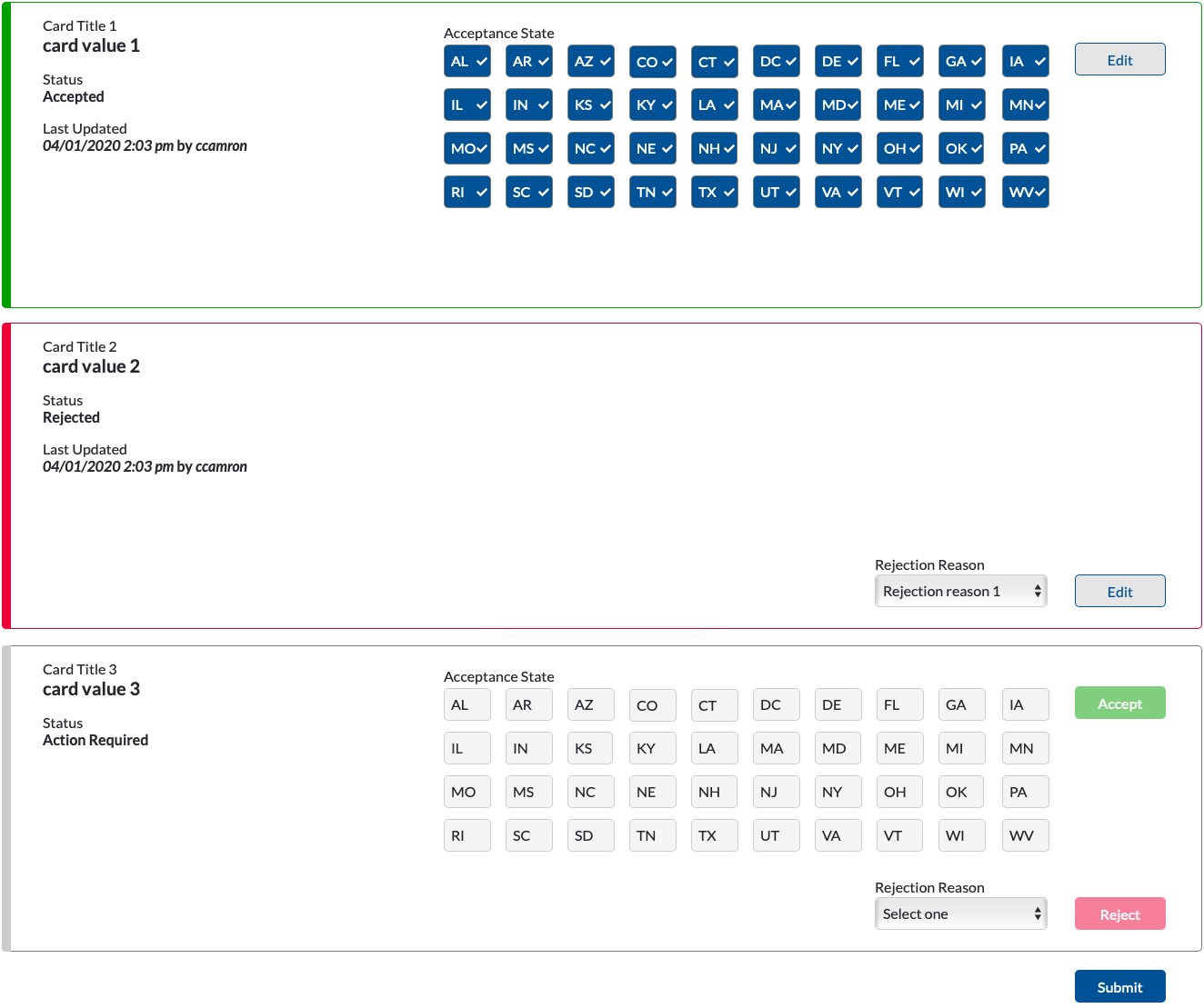
I’ve been working with multiple teams to standardize and simplify internal systems. After understanding context by working with product owners, developers, data scientists, and business stakeholders, I provide wireframes, interactive prototypes, and design evaluation reports.
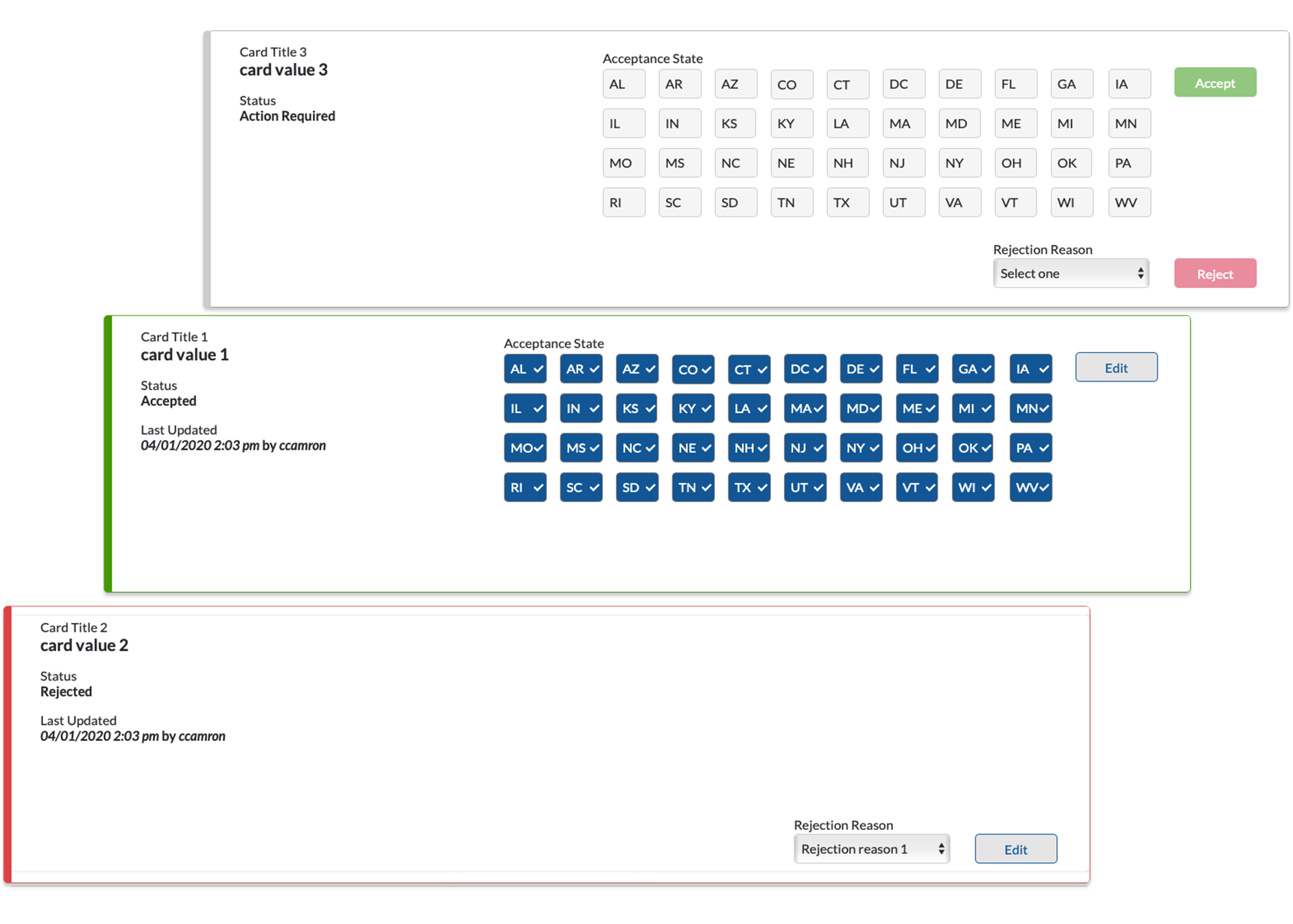
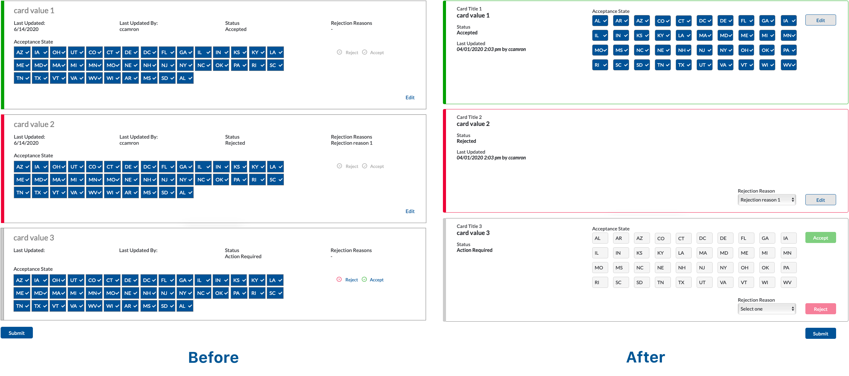
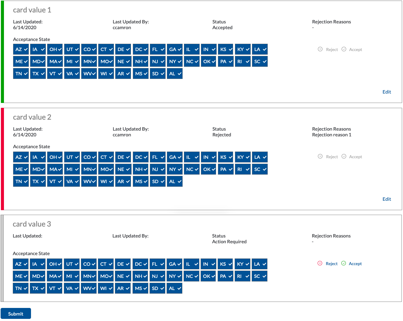
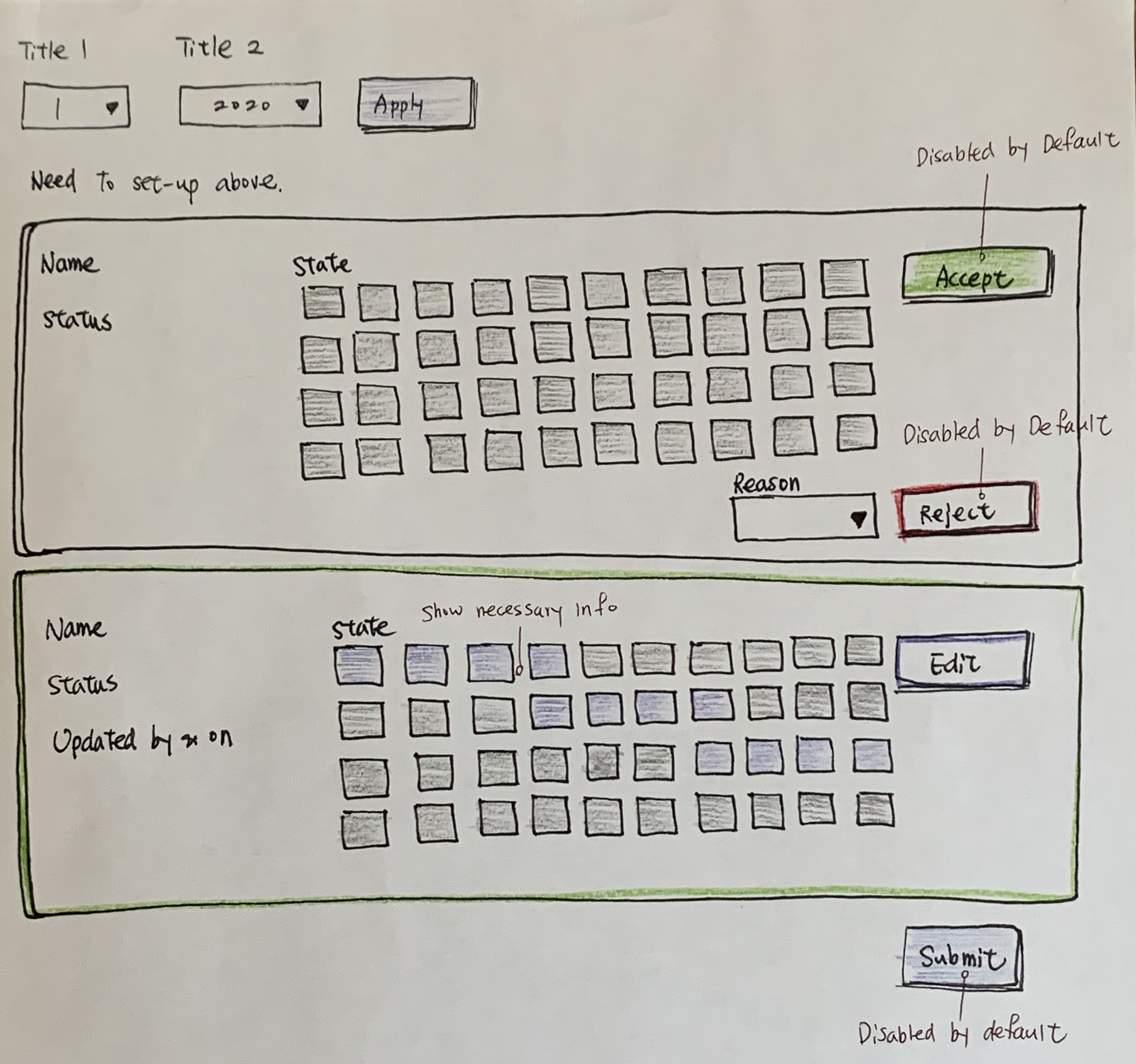
Due to the proprietary nature of projects, I couldn’t share details here. The following is an abstract example of design options I provided.
Time: 12/2019 - Present
My role: UI/UX Designer
Tool: paper wireframe, Adobe Photoshop, Axure
Link: prototype