Work Distribution
Since I had to work remotely most of the time in those five weeks, our team decided that I was in charge of designing interactions and interfaces. They worked on user research and testing. It worked well because we didn't bring interaction-design biases into testing sessions.
Design Process
In order to validate the problem and to have as many design iterations as possible in five weeks, we used paper prototypes for two design iterations. With paper prototypes, we could make changes when critiquing within the team and testing with participants. Then, we moved to high-fidelity prototypes for the third iteration.
Problem
Although all team members had the problem of finding roommates, we wanted to validate this is a common problem not only in the team. We interviewed six participants, who had the experience of looking for roommates before coming to school.
User Journey
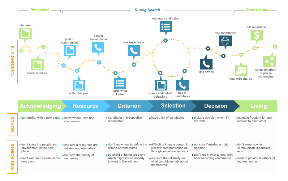
Based on the data collected from interviews, we found that users' needs shared some patterns. I created a user journey map. Thus, it was easy to see the most upset pain points were:
- For a new place you are going to, you don't know where to start to find roommates.
- Once you have roommate candidates, you don't know if they will be good living together.
User Requirements
Based on the journey map, we collected four design requirements:
- Location: users choose the living place according to the distance and time to their work or school.
- Safety: the identification verification of candidates makes users feel safe when considering candidates whom they don't know.
- Communication: people need an easy and quick way to communicate during roommate-screening sessions.
- Behavior: roommates share space, where they have similar values of maintaining the shared space and feeling comfortable being with each other.
Design Direction
When ideating solutions, we came up with three feasible options:
- A digital board on campus
- A web page embedded into the school's website
- A mobile app
We decided to design a mobile application for two reasons:
- Equipment advantage: by using GPS on smartphones, it calculates the commute distance and time; By using the camera, it helps to verify people's identifications by taking photos of their photo ID cards.
- No time and place limitation: from interviews, we found students used phones more frequently than their desktops. Push notifications on smartphones remind people to respond.
Delightful Experience
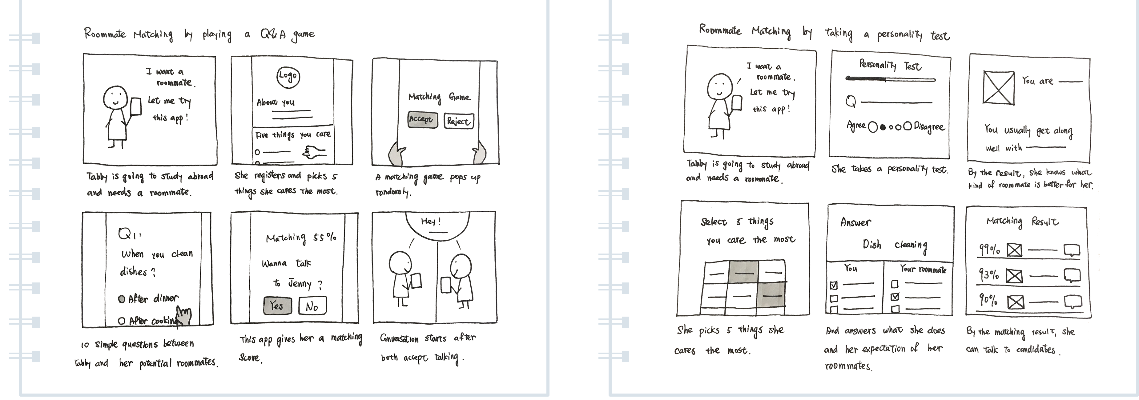
How to transform a complicated roommate-finding process into a fun, delight experience?
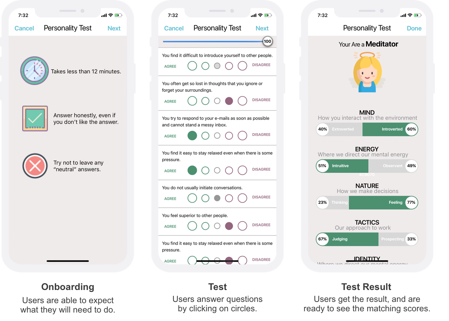
After brainstorming, we selected two from a bunch of ideas: a question-and-answer game (below left) and a personality test (below right). Thus, we asked our friends which idea they liked the most and why. As a result, personality had most of the votes because participants mentioned it was fun to know their own personalities.
Therefore, we included the personality test into our design, matching people based on their personalities.
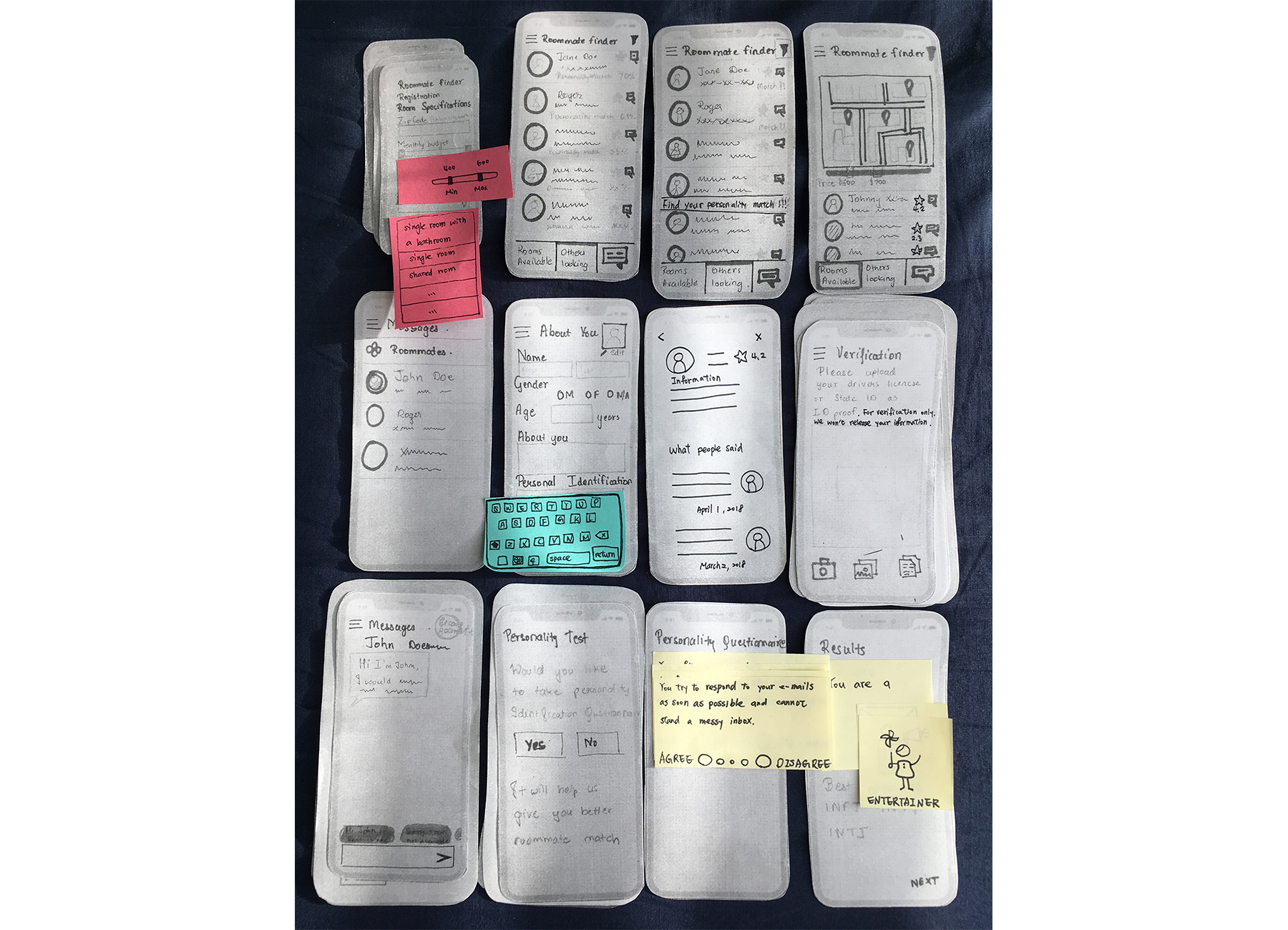
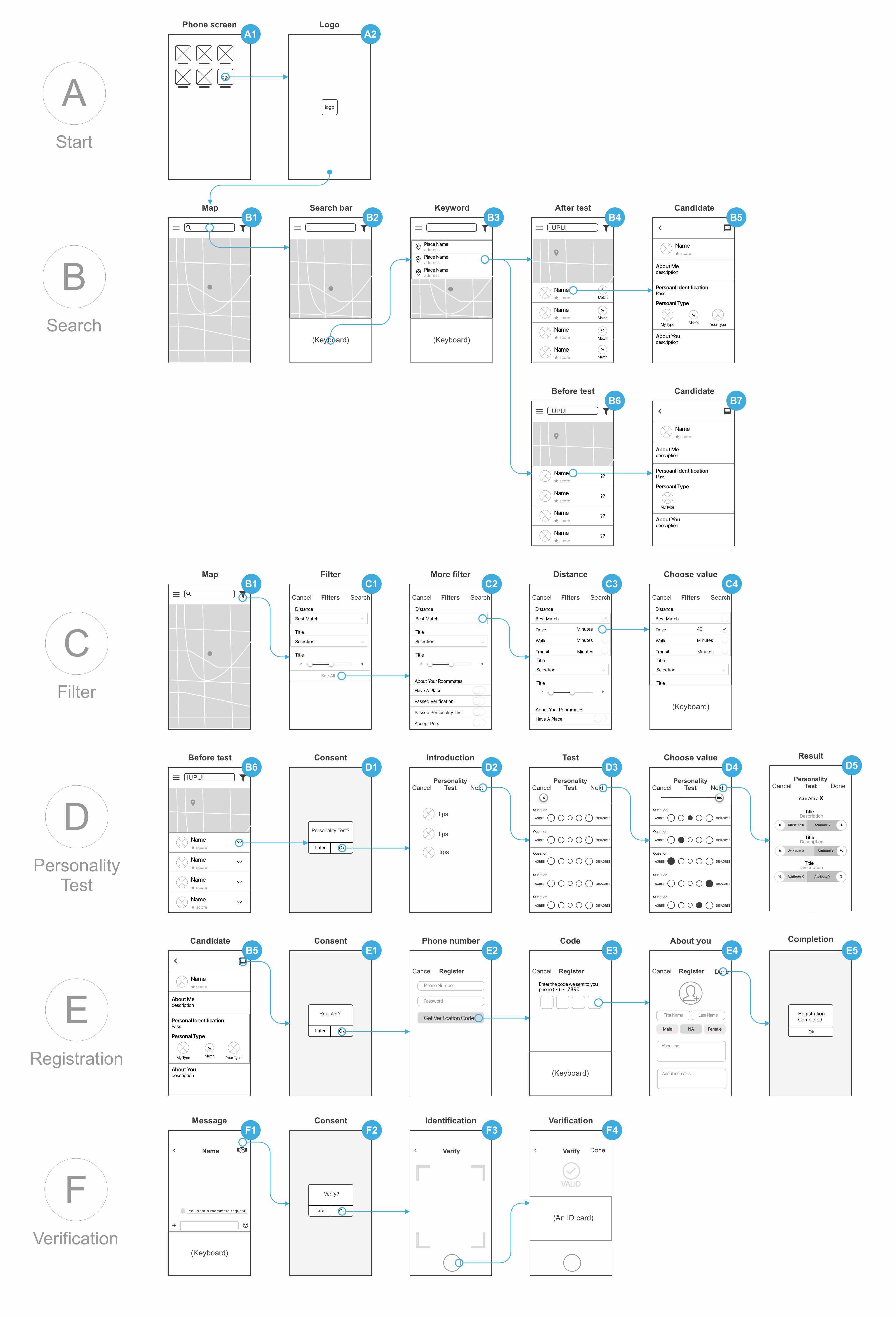
Paper Prototypes
We, as a team, critiqued in the first round of paper prototypes and made the prototype consistent across screens.
After making quick changes, we tested the second version prototypes with four participants, who had experience of finding roommates.
The takeaway from the testing was only asking for actions when it's necessary:
- Taking personality test when users want to know the matching scores between them and roommate candidates. (as seen interactions at the D section below)
- Registering by inputing basic personal information when users want to talk to candidates. (as seen the E section below)
- Verifying identification cards when users want to ask candidates to become their roommates. (as seen the F section below)
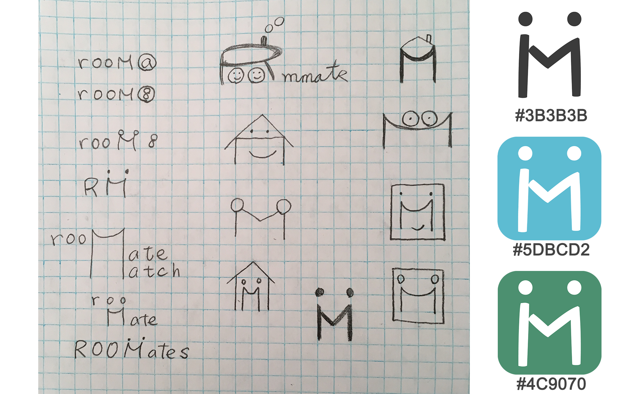
Branding
Keeping logo simple but still maintaining the ideas of communication and friendliness was perfect for the symbol, so I selected the alphabet M and made it look like two persons shaking their hands. For the color theme, I chose the sky-blue color which presented peaceful and wonderful weather shared among roommates.
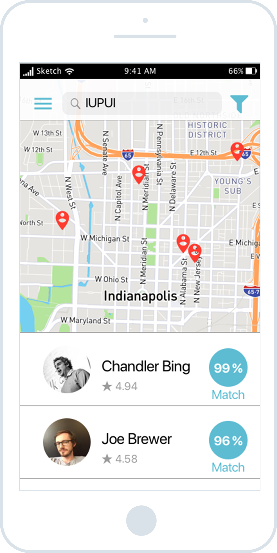
Final Screens
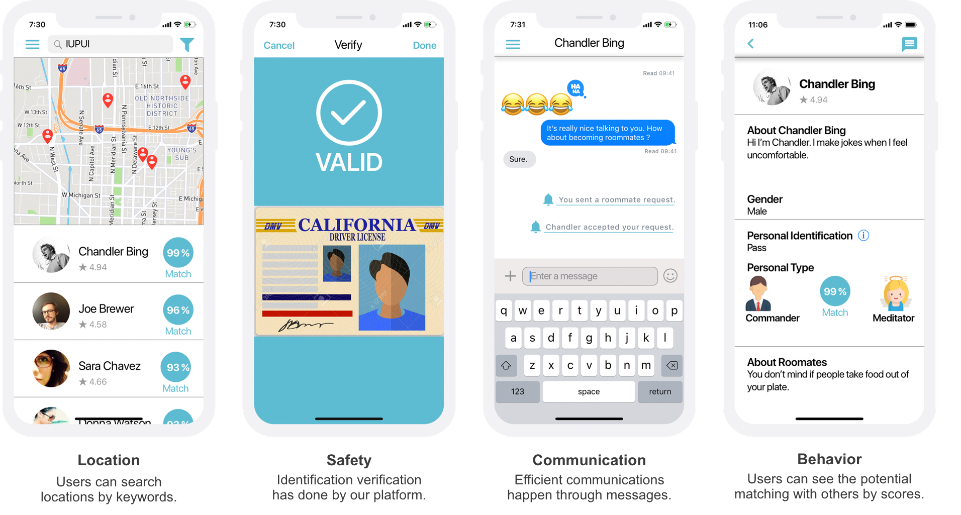
After finalizing the color theme, I built high-fidelity prototypes (as seen screens below). Then I adjusted the high-fidelity prototypes according to the feedback from three participants whom our team conducted the usability testing with. Thus, this mobile app fulfilled four user requirements:
- Location: users search locations by keywords. The red dots on the map display requests for roommates at those locations.
- Safety: this mobile app checks users' identification as the first door of trust. Therefore, users know people whom they want to ask for becomming roommates with have provided valid identifications.
- Communication: this mobile app allows users to receive and send messages immediately. Shorter response time means the faster process of finding roommates.
- Behavior: through personality test, this app estimates how well you get along with others with the matching score, so users can refer to scores to make informed decisions.
Reflection
My teammates and I worked remotely for the majority of the project (I was attending the CHI 2018 Conference in Canada). Despite this, our strong communication skills enabled us to work efficiently, and I also learned that I enjoyed the experience of working remotely. Thanks team!