The Problem
By the literature review and 5 interviews with 2 state park managers and 3 local residents, we found that people don’t know how to measure the water quality and how to improve it. On the other hand, people, unconsciously, don’t know what they usually do would impact their drinking water. For example, using chemicals in lawns. Thus, we listed the research questions:
- How to know the current quality of water that people consume?
- How to know the way of improving water quality?
- How to encourage people to treat the Earth better?
Ideation
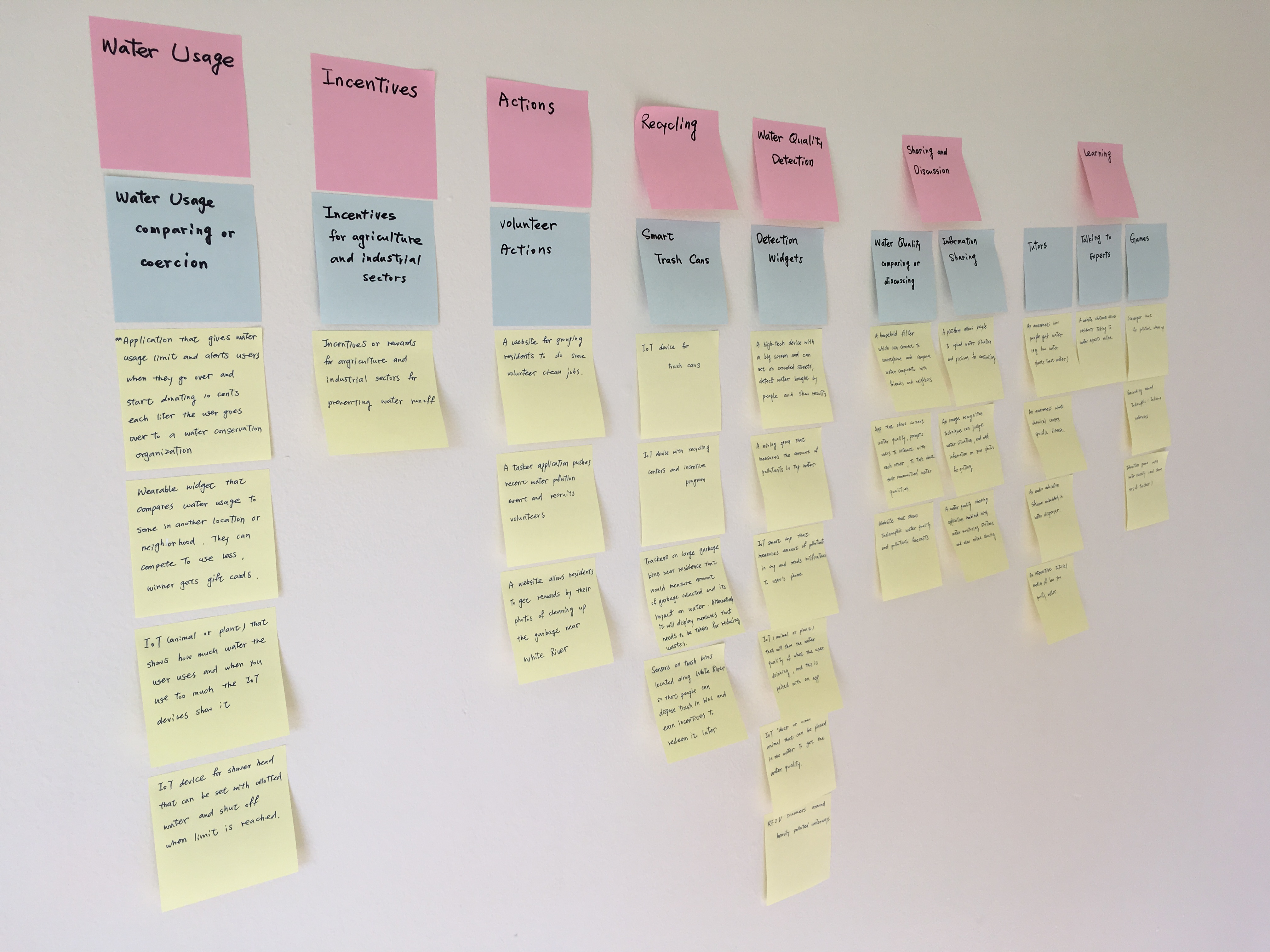
For answering our research questions, our team came up with 50 potential solutions in the brainstorming session. We used affinity diagram (as seen idea notes below) to categorize and prioritize these solutions and then built the design requirements:
- Detection: the user needs a more efficient and simpler way to detect and test the water they consume.
- Education: the system focuses around education and helps create an awareness of water pollution.
- Social interaction: the user needs a format where they can receive instant updates from the community about water quality and events.
- Accessibility: the system enhances the accessibility in the physical structure to consider people with varying accessibility needs.
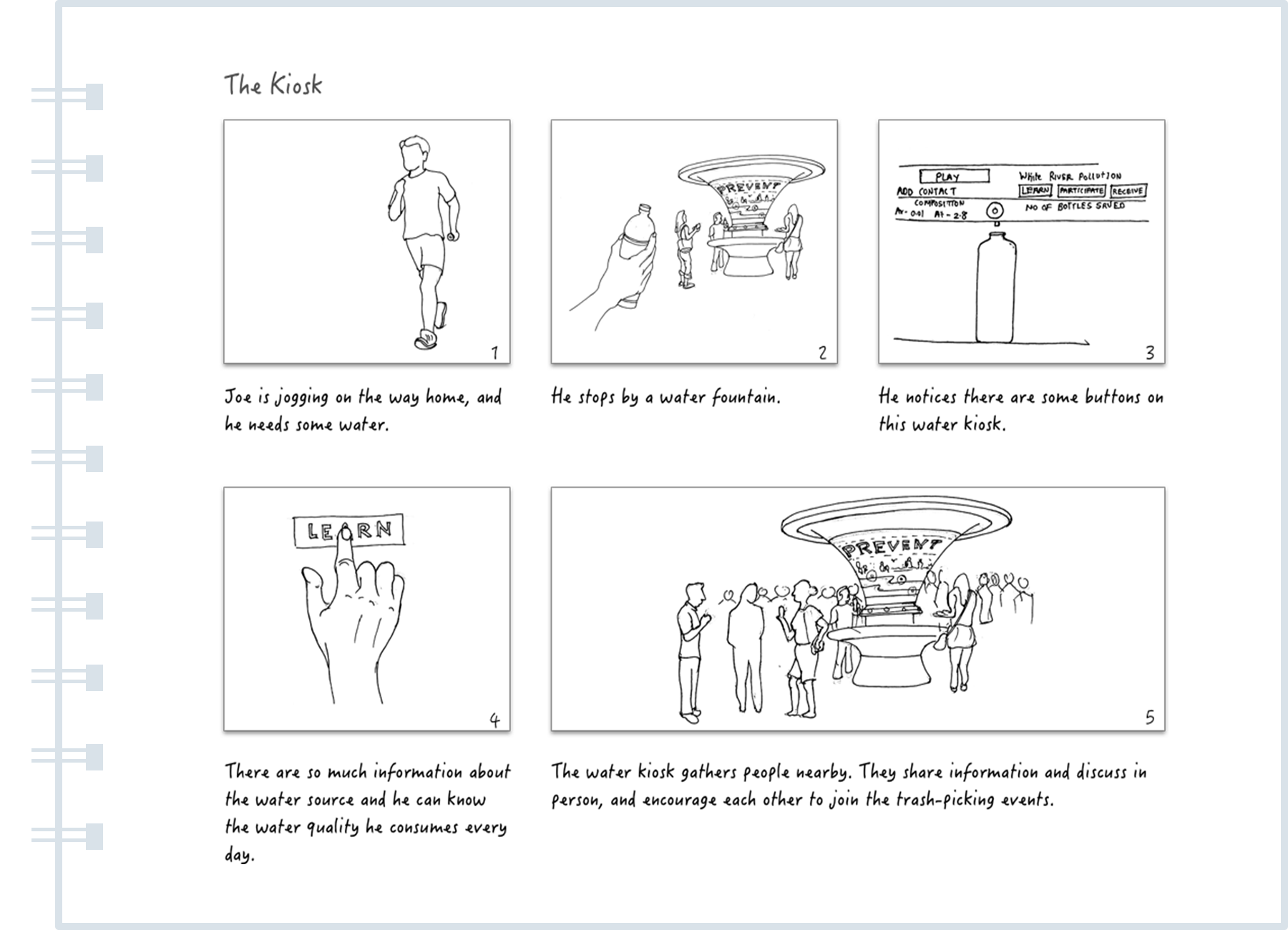
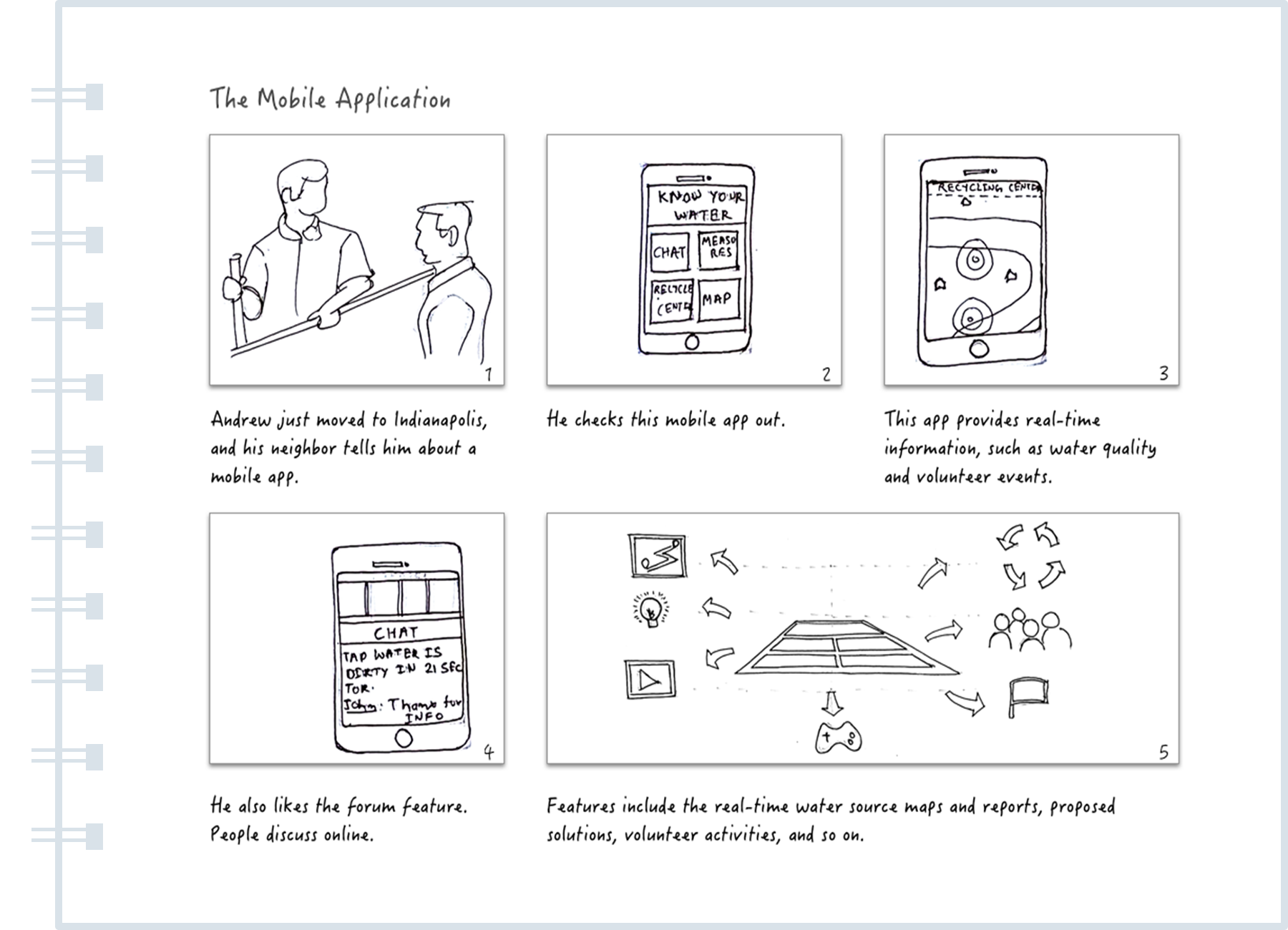
In considering the design requirements, our potential design directions were a kiosk and a mobile application. By creating user scenarios with storyboards (two storyboards blew) in order to think about the user flow, we chose the kiosk solution because we wanted to design a platform where people can physically interact with each other. Therefore, the kiosk would be the best platform to encourage people in an in-person social environment.
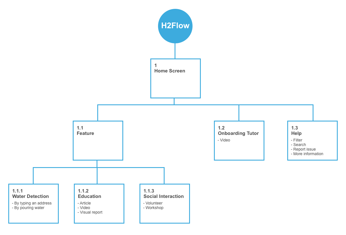
Information Architecture
Depending on the design requirements and the device, we built the information architecture (as seen the structure below) to list the features we were after.
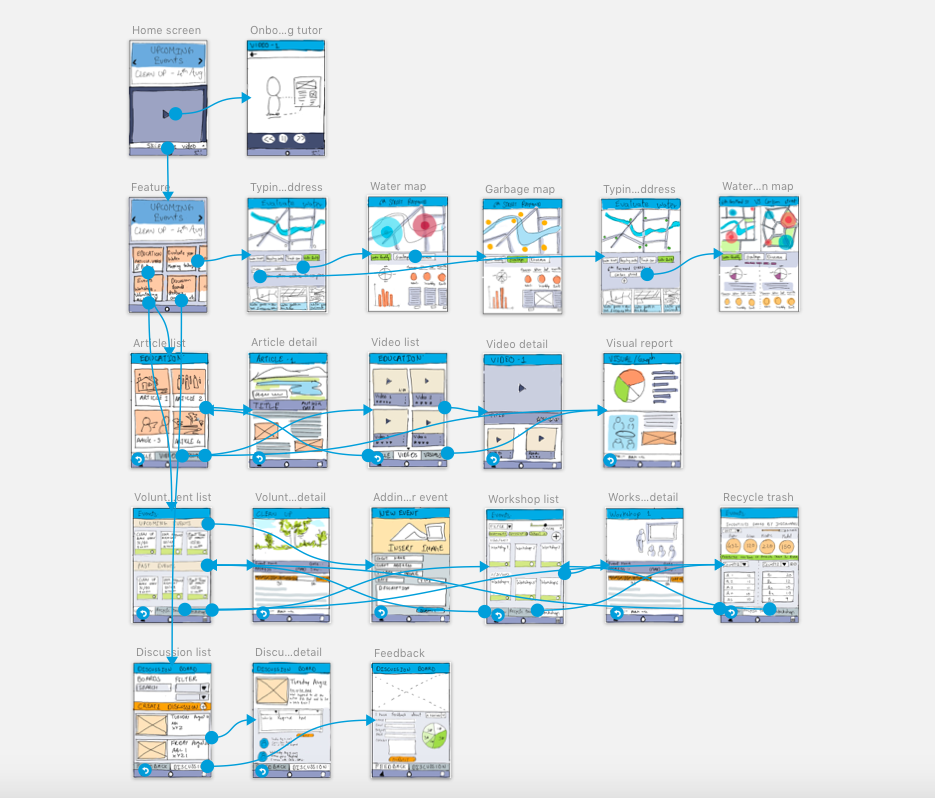
Low-Fidelity Prototype
We prioritized those features, and created the low-fidelity prototype (seen in the following sketches) with several key features: water detection, education, and social interaction.
Internal Walkthrough and Heuristic Evaluation
Because of the limited time period, we conducted two discount methods with the low-fidelity prototype: internal walkthrough and Nielsen’s 10 usability heuristics. We found two issues:
- Consistency: this prototype was made by four teammates, and was inconsistent in its design. For example, some buttons were wrapped by a rectangle while others were simply underlined.
- Kiosk thinking: we needed to ensure that we got out of the mobile app mindset and designed for a much larger screen.
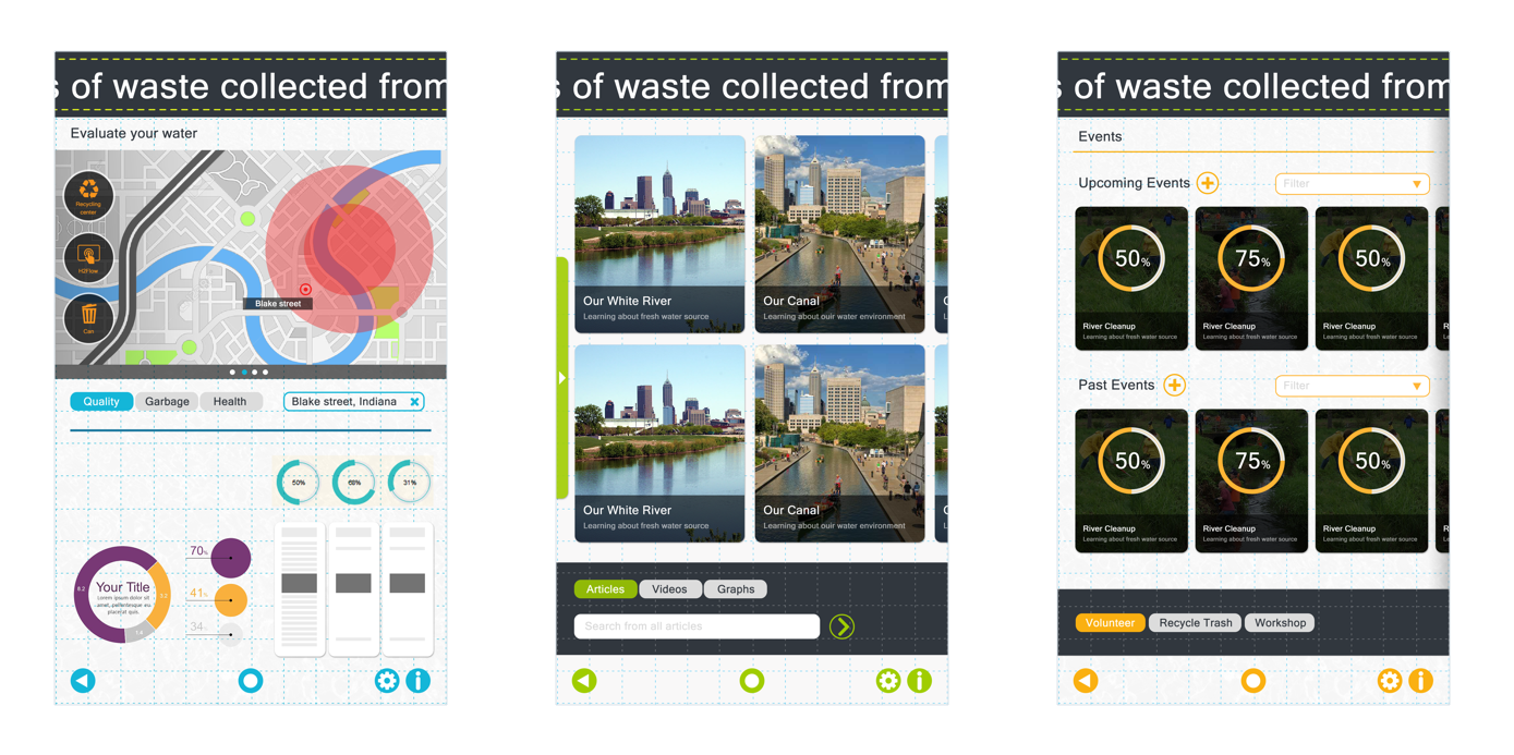
Final Design
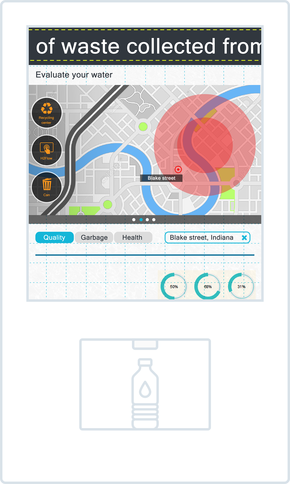
After fixing issues we found at the internal walkthrough session, we created the final design (seen three example screens below) and then tested it with 4 experts (1 Business Analyst, 1 Citizens Energy Group Employee, and 2 senior HCI grad students). During the limited time period, our team believed working with 4 experts from business and design perspectives would bring us useful insights.
Accompanying with screens of the final product (three screens above), now we could answer three research questions:
- How to know the current quality of water that people consume? There are two ways for users to detect the water quality: one is using the “Evaluate your water” feature of the kiosk to check the water quality for a specific location; the other is pouring the water users bring from their home into the kiosk and getting the detection report in seconds.
- How to know the way of improving water quality? The water kiosk shares rich knowledge in forms of articles, videos and visual reports. Based on the information, users can discuss the way of improving water quality or send information to their friends or family.
- How to encourage people to treat the Earth better? By using the water kiosk, users can use the “Events” feature to join volunteering activities or workshops. Through the social interactions, it increases the awareness of water issues and encourages people to positively contribute to their environment.
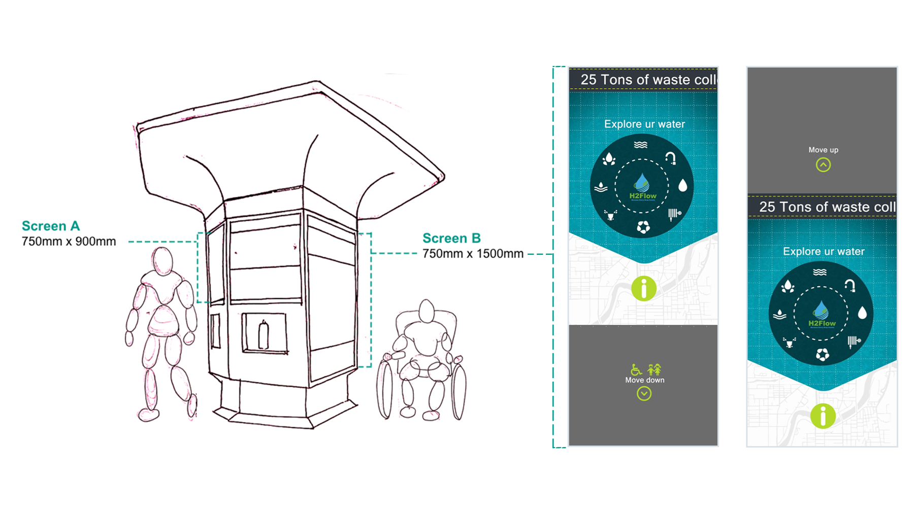
On the other hand, we were sure that our kiosk design should take accessibility into account, since we wanted to make this application accessible for everyone. For this reason, we designed two different screen sizes (as seen two screens below) and people can choose with their accessibility needs. This kiosk is in hexagonal shape with 2 longer screens and 4 shorter screens.
Reflection
This project provided a good opportunity to work with and learn from team members, who have different backgrounds and skills. Thanks Team! I enjoyed applying UX/UI design principles to the problem, and learned the iterative nature of the design process.